| Image |
Comment |
| 05/31/2003 02:28:41 AM |
Shower Viewby timboydwhiteComment by qachyk: I don't know... it's less your subject I have a problem with than the depth of focus, it's very distracting to have that much blur where the colour change is. |
 Photographer found comment helpful. Photographer found comment helpful. |
| 05/28/2003 02:40:32 PM |
Shower Viewby timboydwhiteComment by cmrk74: I really like abstract shots. I like this shot, but It took me a minute to tell what it is. That not necessarily a bad thing-sometimes that is what the photographer wants, is to be not so obvious. In this paticular case I think that adding another element or changing the depth of field (a little) would help. |
| Photographer found comment helpful. |
| 05/27/2003 08:53:26 PM |
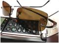
|
| Photographer found comment helpful. |
| 05/27/2003 12:35:54 AM |
Flip modeby timboydwhiteComment by christo: An interesting take on the challenge.
The colors really pop up from the screen as you discover the image, and I like that. ... It was important to focus on that, because the theme is "colors". You managed through your original processing to get vivid and clean colors. This image, with the processing you did, has a surreal look I really like. The fact that I can't really tell what it is makes me focus on the colors, which is the main subject here. Very well done.
However, the way you modified this image makes this entry more a digital work than a photograph. I find it difficult to judge this entry because of that. It is not a photograph anymore in my opinion. I still think it was a good move in the particular case of this theme, because the unreal look focuses on colors, but at the same time I can't stop thinking you're out of the limits of the contest. The best proof is that I can't judge of the quality of exposure here: it is totally irrelevant.
So I have very mixed feelings. I think it is a very good digital work, but not a photograph.
Good luck for your future entries!
The Critique Club |
| Photographer found comment helpful. |
| 05/26/2003 11:30:08 AM |
Shower Viewby timboydwhiteComment by magnus: Great original idea! But if the DOF stretched to the top of the frame, and that lint wasn't there then it would be cleaner. |
| Photographer found comment helpful. |
| 05/26/2003 09:45:08 AM |
|
| Photographer found comment helpful. |
| 05/26/2003 01:16:47 AM |
Shower Viewby timboydwhiteComment by ChrisW123: Cool angle and focus on the top metal part. But I think the image needs darker parts. The shadows (the dark parts) should be almost completely black. |
| Photographer found comment helpful. |
| 05/26/2003 12:50:32 AM |
|
| Photographer found comment helpful. |
| 05/23/2003 05:34:06 AM |
|
| Photographer found comment helpful. |
| 05/21/2003 10:23:00 PM |
|
| Photographer found comment helpful. |
Home -
Challenges -
Community -
League -
Photos -
Cameras -
Lenses -
Learn -
Help -
Terms of Use -
Privacy -
Top ^
DPChallenge, and website content and design, Copyright © 2001-2026 Challenging Technologies, LLC.
All digital photo copyrights belong to the photographers and may not be used without permission.
Current Server Time: 07/16/2026 10:54:11 AM EDT.