| Image |
Comment |
| 04/03/2008 09:02:44 AM |
|
 Photographer found comment helpful. Photographer found comment helpful. |
| 04/01/2008 03:36:07 PM |
|
| Photographer found comment helpful. |
| 03/31/2008 10:58:11 AM |
|
| Photographer found comment helpful. |
| 03/16/2008 11:08:04 AM |
|
| Photographer found comment helpful. |
| 03/16/2008 11:06:06 AM |
|
| Photographer found comment helpful. |
| 03/16/2008 11:04:09 AM |
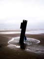
Stick in the Mudby Rainbow-Coloured-SoulComment by bvy: I agree that more detail in the "stick" would have made it more interesting. If it were clearly a true stick -- i.e. a piece of wood clearly recognized as such from the slihouette only -- then it would have been fine. But this is obvoiusly a piece of scrap metal or some other implement with an interesting shape and features, and the fact that you can't figure out exactly what it is is a little disappointing. Also, I agree that the horizon is misplaced. The negative space at the top of the iamge doesn't add much, and when I scroll it off the screen moving the horizon 2/3 of the way up the image, I like it much better.
The blue tassle (whatever that is) is also a little distracting, but I love the textures in the sand (might have brought that out a little more) and the overall lighting.
Oh, it's a girder. I missed that. Still... |
| Photographer found comment helpful. |
| 03/08/2008 03:45:05 PM |
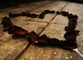
Cross My Heartby Rainbow-Coloured-SoulComment by one2one: If it were not for the underexposed areas this would have done better. You may have wanted a darker toned effect but the lack of detail in the shadows is too much. An angle a little bit higher might have helped too. Great idea. |
| Photographer found comment helpful. |
| 03/08/2008 01:58:01 PM |
Stick in the Mudby Rainbow-Coloured-SoulComment by Rainbow-Coloured-Soul: Originally posted by posthumous:
It's funny to hear people give you advice about how to make a picture of an ugly girder on the beach more pretty. That would be like putting pearls on a pig. Let pearls be pearls and pigs be pigs. This is a glorious ugly pig that got 3 10s, 2 9s and 2 8s. I was one of your 10s. You did very well. |
The reason I entered it, was because I thought it was very beautiful. I could have entered a slow running lake or the ocean, but I went for the girder. I'm much more into wabi sabi than common perceptions of beauty.
You rock PH.
Thanks everyone for your comments *hug* |
| 03/08/2008 01:51:55 PM |
Stick in the Mudby Rainbow-Coloured-SoulComment by posthumous: It's funny to hear people give you advice about how to make a picture of an ugly girder on the beach more pretty. That would be like putting pearls on a pig. Let pearls be pearls and pigs be pigs. This is a glorious ugly pig that got 3 10s, 2 9s and 2 8s. I was one of your 10s. You did very well. |
| Photographer found comment helpful. |
| 03/08/2008 07:57:45 AM |
Stick in the Mudby Rainbow-Coloured-SoulComment by wardmac: Oh, one other thing I should have added. The horizon should "almost" never cross the center of a pic. That said, spome rules get broken for good reason. But in this case I think the centered horizon is a mistake. Use the horizon as a tool to bring impotrance to either the sky or earth. In this shot had the horizon been higher leaving the sky only 1/3 of the scene it would have put more importance on the foreground and the stick. Which seemed to be what you were trying to convey. If the sky has a lot of nice clouds and points of interest then do the opposite and allow it to hold 2/3 of the scene, but know that is whee the viewers eye will go. There are of course exceptions to this rule too.
Enjoy the hobby. |
| Photographer found comment helpful. |
Home -
Challenges -
Community -
League -
Photos -
Cameras -
Lenses -
Learn -
Help -
Terms of Use -
Privacy -
Top ^
DPChallenge, and website content and design, Copyright © 2001-2026 Challenging Technologies, LLC.
All digital photo copyrights belong to the photographers and may not be used without permission.
Current Server Time: 05/07/2026 03:54:03 AM EDT.