|
|
|
Showing 221 - 230 of ~375 |
| Image |
Comment |
| 05/05/2007 05:23:39 PM | |  Photographer found comment helpful. Photographer found comment helpful. |
| 05/05/2007 03:26:44 PM | Blue Sunsetby DUCATISTAComment by Ben: I think you chose to show too much of the rocks to the left, should have aimed further right to capture more of that amazing sunset. As you didn't the subject is placed in the centre of the shot, which feels kind of awkward. | | Photographer found comment helpful. |
| 05/05/2007 12:44:04 PM | | | Photographer found comment helpful. |
| 05/04/2007 12:32:05 PM | | | Photographer found comment helpful. |
| 05/04/2007 10:29:34 AM | | | Photographer found comment helpful. |
| 05/04/2007 02:25:13 AM | On The Edge by DUCATISTAComment by puzzled: WOW, T! Another ribbon?!? I'm just checking in to dpc now quickly after a pretty long absence. You are doing so well. Congrats and keep it up! | | Photographer found comment helpful. |
| 05/04/2007 02:22:04 AM | The Big Bang by DUCATISTAComment by puzzled: What a great image, T! The lighting, composition,... everything is just right. You're great. I'm really happy you won a ribbon after such a short time - yay for you! (och grattis!!) | | Photographer found comment helpful. |
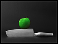
| 05/04/2007 02:02:04 AM | On The Edgeby DUCATISTAComment by DUCATISTA: Originally posted by karmat:
CRITIQUE CLUB CRITIQUE
by karmat
It is truly difficult to "critique" a ribbon winner without sounding like I am just searching for things to complain about.
So, I'll tell you what I think works in this shot, and what was appealing, and what I *personally* think could be "improved" upon.
Technically, you have nailed it. The lighting on this is consistent and even. This allows for details to show throughout the shot. It also makes for a very clean, well focused shot. The slight shadowing on the apple also gives just a touch of depth, otherwise the shot might appear to be a bit flat. The focus is good and the water on the apple gives it a nice touch.
Compositionally, to me, it is static. To have the knife straight through the shot, gives it kind of a "ho-hum" feeling. Granted, the knife is in the lower third of the picture, and that gives it a sense of strength, and the apple is just off of center, so that helps to counter the "static" feeling, but it doesn't add any real interest to the shot.
I think technically, you have done a very good job, and the voters rewarded you handsomely for that. Congratulations! This would be an excellent stock type shot as well.
karmat |
Thanks karmat for your critique, I really appreciate it! That's why I'm here on DPC; to learn and to improve. I have never ever taken picures like this before (just 'holiday pictures' :) and I'm very much a beginner in Photoshop, so have a lot to learn!! |
| 05/03/2007 10:56:16 PM | The Big Bangby DUCATISTAComment by jaysonmc: Seems a little too studio/contrived for me, but every one has their style. Still wonderful technicals. Good control of lighting. Nice use of the frame with good use of competing elements (color and lines). The repeating circles (two full circles, plus semi-circle)is a plus. It ends up being a superb entry and very deserving of a ribbon. While it isn't for me, it still would have garnered a high rating from myself because it is quality. Congrats on the ribbon! | | Photographer found comment helpful. |
| 05/03/2007 06:15:01 PM | On The Edgeby DUCATISTAComment by karmat: CRITIQUE CLUB CRITIQUE
by karmat
It is truly difficult to "critique" a ribbon winner without sounding like I am just searching for things to complain about.
So, I'll tell you what I think works in this shot, and what was appealing, and what I *personally* think could be "improved" upon.
Technically, you have nailed it. The lighting on this is consistent and even. This allows for details to show throughout the shot. It also makes for a very clean, well focused shot. The slight shadowing on the apple also gives just a touch of depth, otherwise the shot might appear to be a bit flat. The focus is good and the water on the apple gives it a nice touch.
Compositionally, to me, it is static. To have the knife straight through the shot, gives it kind of a "ho-hum" feeling. Granted, the knife is in the lower third of the picture, and that gives it a sense of strength, and the apple is just off of center, so that helps to counter the "static" feeling, but it doesn't add any real interest to the shot.
I think technically, you have done a very good job, and the voters rewarded you handsomely for that. Congratulations! This would be an excellent stock type shot as well.
karmat | | Photographer found comment helpful. |
|
Showing 221 - 230 of ~375 |
Home -
Challenges -
Community -
League -
Photos -
Cameras -
Lenses -
Learn -
Help -
Terms of Use -
Privacy -
Top ^
DPChallenge, and website content and design, Copyright © 2001-2026 Challenging Technologies, LLC.
All digital photo copyrights belong to the photographers and may not be used without permission.
Current Server Time: 07/16/2026 12:19:17 PM EDT.
|