| Image |
Comment |
| 07/21/2003 12:05:32 PM |
|
 Photographer found comment helpful. Photographer found comment helpful. |
| 07/21/2003 10:18:53 AM |
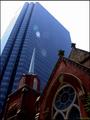
The Old Contrasts The Newby cmrk74Comment by alanfreed: Very, very similar to my shot, actually! The church could be a little brighter, and of course people are going to whine a bit about the lens flare, but it's still a nice image. |
| Photographer found comment helpful. |
| 07/20/2003 03:48:56 PM |
Well Rounded Pleasureby cmrk74Comment by banmorn: hmmmm. there not exactly round are they?
the light shoudl be from a different direction, the ends are naturally darker and are in a shadow here. perhaps if you had focused further on up the line ( to your left) and not shot from the end, then the flatness of the end ciicar in this would not be seen. Also some are rounder than others, you might have placed them up front.
The composition is fine. |
| Photographer found comment helpful. |
| 07/19/2003 07:29:01 PM |
|
| Photographer found comment helpful. |
| 07/19/2003 07:11:47 PM |
Well Rounded Pleasureby cmrk74Comment by ScottK: They look more square than round. Composition is good, and I like the DOF. I'm not wild about the lighting. I'd have liked the front to be a little less dark and shadowy. |
| Photographer found comment helpful. |
| 07/17/2003 05:38:12 PM |
|
| 06/20/2003 07:00:19 AM |
Planning and Calculatingby cmrk74Comment by mbardeen: Greets from the Critique Club:
Hi Mark,
This is an appealing image, I like the colours you've used in the duotone process and it really puts me in the blueprint mood. The composition of this shot is good, but not excellent. I do like all the angles yet it still comes out feeling bit busy. Perhaps a simpler setup would have worked better? The glare doesn't bother me very much - I actually quite like the effect, but that's just me.
Hope this is helpful! Good job and good luck in future challenges.
-Matt |
| 06/15/2003 06:47:26 PM |
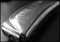
Antique Echoby cmrk74Comment by OneSweetSin: Critique Club
Very nice represntation of sound. It could have been improved more had someone been playing it.
Over all the focus and dof are good on this only thing that is slightly off is your lighting it just gets to dark on the right side. Also had you been able to cut back the lighting glare on the harmonica itself it would have helped.
Anna |
| 06/15/2003 12:37:00 PM |
|
| Photographer found comment helpful. |
| 06/11/2003 01:20:53 PM |
Planning and Calculatingby cmrk74Comment by frisca: I like the full composition, but the huge glare/hotspot on the left is throwing the shot off. My dad was a draftsman and used to design all sorts of structures, so this really brings back some fond memories for me. Thank you. |
| Photographer found comment helpful. |
Home -
Challenges -
Community -
League -
Photos -
Cameras -
Lenses -
Learn -
Help -
Terms of Use -
Privacy -
Top ^
DPChallenge, and website content and design, Copyright © 2001-2026 Challenging Technologies, LLC.
All digital photo copyrights belong to the photographers and may not be used without permission.
Current Server Time: 07/15/2026 01:11:26 PM EDT.