| Image |
Comment |
| 02/05/2003 04:00:10 AM |
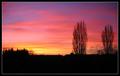
Winter Sunsetby ManicComment by ChrisW123: Wow, that is really beautiful! The colors are spectacular and the dark trees and landscape give a great contrast. 10. |
| 02/05/2003 03:12:02 AM |
|
| 02/04/2003 08:53:16 PM |
Winter Sunsetby ManicComment by rmahan: Wow ... what a fantastic color. You selected a great sky and time of day to shoot this one. |
| 02/04/2003 08:31:39 PM |
Winter Sunsetby ManicComment by PTLParsons: This is a beautiful silowette (sp) and the colors are out of th world. Some won't but I do like the cropping of the shorter bushes on one side, buildings, then the 2 taller bushes on the other side. To me that sets off the photo. To me you have nailed this sunset. Great job, well done. |
| 02/04/2003 05:13:13 PM |
|
| 02/04/2003 03:15:25 AM |
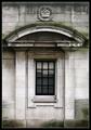
Royal Decayby ManicComment by sulamk: Greetings from the Critique Club
A good Photo of Architectural detail, but it is just technically good it doesn't have that little bit extra that say Wow!
It is a little overexposed in the middle did you use a flash close up?
I feel that it might have helped the flatness if it had been black and white I can see a good tonal range possibilities in this, all that lovely decay and the straight lines.
Well tried, it probably would have done better in the square challenge where no enhancements were allowed.
|
| 02/03/2003 11:39:30 PM |
Winter Sunsetby ManicComment by Silver Fox: Beautiful colors in the sky, and the silhouette of the tree's, bush, and buildings make a big difference to the landscape. My eyes focus on the colorful sky and just stay there, wishing it would never end. Nice job. |
| 02/03/2003 10:16:33 PM |
|
| 02/03/2003 08:23:34 PM |
Sound Worksby ManicComment by indigo997: Hi, Manic!! Here are my thoughts. Of course my square shot stank so feel free to ignore me.
*lol* at some of your comments. You got a lot of them! This photo isn't very easy on the eyes. It's simple and straight forward. It fits the challenge. All those holes and that bright glare just turns me off. I do like the color, but it's too bright. I also think it's a little weird to see a bg on just 3 sides and have the 3rd cropped like it is. I have to agree that it's just a little boring. If you're gonna have such a simple subject then it's gotta be presented in a really interesting or different way. Maybe an abstract but definitely different lighting. I really don't know what else to say about it. The focus and quality seem good. I don't really think that many people COULD take a much better picture of this subject so... It all goes back to coming up with a good idea in the first place. Just don't come to me for ideas cause I don't have any :P Message edited by Manic - fixing an annoying typo ;o). |
 Photographer found comment helpful. Photographer found comment helpful. |
| 02/03/2003 12:26:15 AM |
Winter Sunsetby ManicComment by Lustre: The colour is great and the silohuette works well. The balance between sky and land is also good. I think it would have been better if it only featured the tress though, and not the buildings in the distance - they compete a little and I think the trees would always win. The aspect ration of your final image is well suited to the topic. |
Home -
Challenges -
Community -
League -
Photos -
Cameras -
Lenses -
Learn -
Help -
Terms of Use -
Privacy -
Top ^
DPChallenge, and website content and design, Copyright © 2001-2026 Challenging Technologies, LLC.
All digital photo copyrights belong to the photographers and may not be used without permission.
Current Server Time: 07/26/2026 07:51:14 AM EDT.