DPChallenge: A Digital Photography Contest You are not logged in. (log in or register
 
Browse Settings
Currently viewing:
AdministratorManic

Show comments:

Per page:

Order:

Comments:


Comments Received by Manic
Pages:   ... ... [138]
Showing 271 - 280 of ~1380
Image Comment
Neapolitan Views
11/14/2005 12:50:13 AM
Neapolitan Views
by Manic

Comment by Bear_Music:
Lovely, gritty images. Is this Chiqui and her dust?
Photographer found comment helpful.
Neapolitan Views
11/14/2005 12:45:51 AM
Neapolitan Views
by Manic

Comment by Jutilda:
I love the silhouette of the people in the center shot. Has an old movie sense to it. Nicely done.
Photographer found comment helpful.
Shocked!
09/15/2005 01:54:34 AM
Shocked!
by Manic

Comment by Rikki:
Greetings from the Critique Club

First Impression - when I saw the image, it was exactly as what you intended OMGWTF

Most of the comments I will leave you are from my humble opinion only. Let's get started shall we?

Composition:
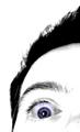
This image rehashes images of the famed Blair Witch Project. I do like the "one eye" crop as opposed to perhaps both eyes within the frame of the shot. The image would probably be more powerful had you used the rule of thirds for the crop. IMHO, since the eyes are the major subject of this image, I think they are situated too low from the third line horizon.

Camera Work:
I do like the fact that you used the aperture you specified here. This focuses all my attention to your eyes then your brows and the rest just fades into the background. Kudos to you. The straight shot is also great as opposed to a "tilted" shot. I don't think it would have the same power and drama as this one portrays.

Post-processing:
Great job on the selective desat on this image. As my eyes look at the image and slowly moves around it, my eye is almost always drawn to your blue gray eyes. I am not certain if you really have this natural eye color as I can see traces of brown and amber as I look closely at it. The veins are something I'm not particularly too keen at - again, just my opinion. It's probably because the veins are colored and not desaturated. Had they been, then it wouldn't be too much of slight distraction.

I think the highkey approach here is excellent. I adjusted the balance on the brightness and contrast and there is definitely no other distracting elements within your composition.

Great job on burning your eyelashes and eyebrows. I think it adds more depth and texture to your image.

My Final Thoughts:
This image meets the challenge in my opinion and your title is on the mark. I believe it is a great image that portrays power, emotion and disbelief. Great decision on not adding a border to this image as I agree, it would only distract from the overall feel of your photo.

I look forward to seeing more of your work.

If you have any questions about this critique, please feel free to contact me via the PM system.

/edited spelling errors

Message edited by author 2005-09-15 01:59:53.
Photographer found comment helpful.
Shocked!
09/11/2005 10:03:49 PM
Shocked!
by Manic

Comment by Tammer:
An eye opening photo (sorry, couldn't resist). For me though, the whites seem overly saturated.
Photographer found comment helpful.
Shocked!
09/10/2005 05:18:21 PM
Shocked!
by Manic

Comment by owen:
Bazarre shot. I like it.
Photographer found comment helpful.
Shocked!
09/10/2005 02:04:00 PM
Shocked!
by Manic

Comment by jtf6agent:
Everything was donew nicew here, composition, focus, creativity and challenge. For some reason though I just don't get a really good pop out of this photo.
Photographer found comment helpful.
Shocked!
09/10/2005 08:54:49 AM
Shocked!
by Manic

Comment by marklovell:
Striking composition and use of selective desat. Focus seems a little off - would prefer it in the eye. Could be my monitor. 9.
Photographer found comment helpful.
Shocked!
09/09/2005 10:51:34 PM
Shocked!
by Manic

Comment by kaputol:
Of the pictures on the page, this one caught my eye (not literally though)
Photographer found comment helpful.
Shocked!
09/09/2005 01:43:02 PM
Shocked!
by Manic

Comment by mycelium:
I think that more of the image needs to be in better focus. Having the primary focal point so close to the bottom of the frame is generally not recommended. [how this comment is, somehow, the only one out of all the comments on this photo NOT considered helpful is beyond me. it is direct and substantive, yet apparently worthless to you.]

EDIT BY MANIC: because you completely missed the point of the photo, that's why :o)

Message edited by Manic - reply.
Shocked!
09/08/2005 05:21:16 PM
Shocked!
by Manic

Comment by mesmeraj:
the purple vein is a little creepy - would have cloned or desat'd it myself. I like the focus.
Photographer found comment helpful.
Pages:   ... ... [138]
Showing 271 - 280 of ~1380


Home - Challenges - Community - League - Photos - Cameras - Lenses - Learn - Help - Terms of Use - Privacy - Top ^
DPChallenge, and website content and design, Copyright © 2001-2025 Challenging Technologies, LLC.
All digital photo copyrights belong to the photographers and may not be used without permission.
Current Server Time: 06/18/2025 11:37:46 AM EDT.