| Image |
Comment |
| 07/09/2005 12:07:23 PM |
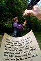
Following Shakespeare's Leadby magnusComment by SJCarter: *Critique Club Comment*
First of all, I think it met the Leading Lines II Challenge quite well (both figuratively by the words and literally by the line of the pen).
Composition
I think it is well composed, but might add some interest by off-centering your subjects a little more. The different sizes of your subjects in the foreground, midground, & background work well to establish both perspective and depth.
Lighting
Love the sparkle of light on the pen. Very good lighting on the paper and great lighting on the rose. The model could use a little more light/contrast and evening out of tones/highlights. I think the background is a little dark.
DOF
Excellent. The only minor thing I notice is that the model could be a little less "soft". Also, perhaps less emphasis on the background (gaussian blur perhaps?).
Color
Also very good. My only suggestion is again regarding the background. Perhaps bumping the sat up would make it brighter and more interesting (IMHO).
Overall
A really strong entry that I think finished much lower than I expected. You met the challenge perfectly and executed a technically superior image. Great job!
Just my 2 cents...
Jimmy
|
 Photographer found comment helpful. Photographer found comment helpful. |
| 07/03/2005 11:45:09 PM |
|
| Photographer found comment helpful. |
| 07/03/2005 04:01:25 PM |
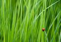
Splendor in the Grassby magnusComment by arnit: Critique Club:
Heill og sæll Magnús,
Mér líkar þessi mynd mjög. Myndbyggingin er mjög góð og litirnir frábærri. Bjallan vel staðsett í rammanum. Mjög lítið út á hana að setja ef ég á að segja alveg eins og er. Sem sagt myndina en ekki bjölluna :) Eina sem pirrar mig smá er þetta gras neðst í hægra horninu. Væri lítið mál að cropa það bara í burtu. Góð mynd í alla staði.
Hope you understand Icelandic :) |
| Photographer found comment helpful. |
| 07/03/2005 09:58:43 AM |
Following Shakespeare's Leadby magnusComment by RolandB: This is a very interesting shot. A written leading line used as a compositional leading line. Great DOF. Clever concept. Very good. Bumping up quite a bit! |
| Photographer found comment helpful. |
| 07/02/2005 08:54:56 AM |
|
| Photographer found comment helpful. |
| 07/02/2005 02:54:02 AM |
Following Shakespeare's Leadby magnusComment by Mr_Pants: A very clever idea indeed. I do feel, however, that a little bit of sharpening could be applied to the subject, as she looks to be a little soft in comparison with the sharp lettering. |
| Photographer found comment helpful. |
| 07/02/2005 12:58:02 AM |
|
| Photographer found comment helpful. |
| 07/01/2005 09:13:16 PM |
Following Shakespeare's Leadby magnusComment by phoensoul: The pen certainly appears to be mightier than the sword. Very well photographed, nice even exposure. A less generally familiar font would have been a good idea. |
| Photographer found comment helpful. |
| 07/01/2005 03:56:31 PM |
|
| Photographer found comment helpful. |
| 07/01/2005 01:32:04 PM |
|
| Photographer found comment helpful. |
Home -
Challenges -
Community -
League -
Photos -
Cameras -
Lenses -
Learn -
Help -
Terms of Use -
Privacy -
Top ^
DPChallenge, and website content and design, Copyright © 2001-2026 Challenging Technologies, LLC.
All digital photo copyrights belong to the photographers and may not be used without permission.
Current Server Time: 06/23/2026 12:03:50 AM EDT.