|
|
Comments Received by Drake
|
Showing 451 - 460 of ~3538 |
| Image |
Comment |
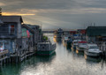
| 08/21/2015 08:31:01 AM | Leland Sunsetby DrakeComment by sidpixel: *Hello from Sid and the Critique Club*
A pleasing scene assumed to meet the challenge.
This tranquil scene is all about the quality of light, the gentle rays leading us from bright sunlight to the inner portion of the scene and the illuminated hulls reflected in the water, the very things that obviously attracted you in the first place. It's a shame the boat on the left is such an ugly beast.
Apart from the gentler brighter light the scene is generally low key and fairly monotone, verging towards black and white with subtle colouring. The only parts of the image that break that quality are the American flag on the left and, this is where I have the only problem with the image, the person on the left. He is so extremely positioned right on the edge of the frame that he would be better cropped out. If your original has more scene to the left then he should be included as his presence definitely adds but not in this extreme position. If he were to be added with space around him then he also ought to be dodged to subdue his colouring more in keeping with the rest of the image.
Thank you for an interesting submission, Sid |
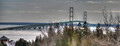
| 08/13/2015 06:44:26 AM | Bridge To The "Trolls"by DrakeComment by sidpixel: *Hello from Sid and the Critique Club*
A pleasing record shot of an attractive bridge
This is the second shot of yours of this bridge I have had the pleasure of commenting on, from the outset I have to say I prefer the other, the lighting is much better. You have an interesting sky as an effective backdrop which is nice but the foreground is the main problem here, it interferes rather than enhances the image. It's a real shame you weren't able to get into a more elevated position whereby you could include the foreground without it impeding upon the bridge itself.
The bridge is a very attractive example of practical engineering and thus will always make an attractive image which is why it needs enhancing in some way to make it stand out from the crowd. You achieved that with your other image through the quality of the light, with this one however, I'm afraid you haven't managed it as well.I hope the water's not like that all year round!
Thanks for your submission, Sid |
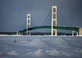
| 08/12/2015 03:15:27 PM | 6.1by DrakeComment by sidpixel: *Hello from Sid and the Critique Club*
An appealing image that meets the challenge
Your image is all about light, the quality of the light on the bridge here is excellent making it stand out from the background. It's a shame that bother towers aren't lit top to bottom in the same way as the foreground one. I like the way the spars, at least in the foreground, are well defined again through the lovely light. The plain sky and woodland acts a good neutral background to the bridge but the snow's shadow does rather nullify the effect of the lovely light. If you could selectively increase the exposure for the foreground snow I think this would lift the whole image.
I don't agree with your commenters that the image is flat but I think the foreground snow is influencing their judgment. I like your composition it fits the subject well, the frozen waters are an essential ingredient of the whole image and the frozens 'mountains' form an interesting detail of the foreground. All in all a pleasing result.
Your estimated score was quite an accurate assessment, I hope you were pleased, Sid |
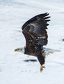
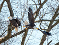
| 08/11/2015 06:26:22 AM | "It Was Love At First Sight", Joseph Heller, Catch-22by DrakeComment by sidpixel: *Hello from Sid and the Critique Club*
A great capture whose title fills the challenge brief.
Wow, from one eagle study straight to another of yours and an excellent capture it is too! I can see that eagles are indeed a favourite of yours and your perseverance has paid off well here you have a great action shot. I can understand your love of the birds but I wonder how many others here will share it certainly some will but not all which means the image on its own without your title will probably not fulfil the challenge brief therefore it is dependant upon your title.
With regards to the shot itself, you have a great panning shot that has captured good sharp detail of the bird particularly those talons, I wouldn't like to be on the receiving end of those! I'm no expert on eagles particularly bald eagles but I assume the colouring of the head is due to this being an immature bird? The wing shape is good but I would prefer to see some motion in the wingtips with a lower shutter speed but that's just me, I know most people here seem to like everything frozen with high shutter speeds. The other thing I would prefer is a little more room for the bird to fly into, your composition is good and with the available space gives a little more room for it but there's the problem for me, it is just too tightly cropped. The dark patch below him might be better if it were merged more into the surroundings but its a minor point.
All in all an excellent shot, I look forward to more eagles from you, Sid. |
| 08/11/2015 06:07:53 AM | "Already Gone", by the Eagles......by DrakeComment by sidpixel: *Hello from Sid and the Critique Club*
A good wildlife capture that fits the challenge well.
A good capture your timing and subject fits the title and challenge perfectly. I like that you have managed to get good detail in the birds against that bright sky. Talking of sky it is so bright it is overpowering and would benefit from being subdued somewhat. It would also be good if the whites of the birds, in particular their heads, could be improved they have a blueish tint that detracts.
There's nothing you can do about it I know, but the birds wings are tending to be camouflaged by all the tree's structure which is unfortunate as its not showing them at their best. Your composition is good with room for the bird to fly into whilst still giving sufficient space for the remaining bird. I think your bright sky is the biggest problem here the image actually hurts your eyes if you look at it too long.
Thanks for your submission, Sid |
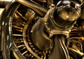
| 08/09/2015 09:55:58 AM | WW 2 Engineby DrakeComment by sidpixel: *Hello from Sid and the Critique Club*
A noble attempt that I assume meets the challenge.
What a lovely old engine this is, I can see what attracted you to it there's lots of lovely detail but there's the rub, I think you lost an opportunity to make more of this. I like your composition and the focus point clearly on the famous name which helps identify it and its era. What I am less happy with is your chosen aperture, the DOF is too shallow. You probably decided that you wanted to draw the viewers attention to the name to the exclusion of everything else but in my mind there was further great potential in the reflections in the centre hub such as we get a hint of in the cowl.
The tint works quite well here especially being a vintage engine a sepia type tone gives it a sense of antiquity. What I definitely do not like are the blown highlights. I know it can be difficult to get the right exposure especially with chrome under spotlights but there is too much here, it might have been better to combine a couple of exposures to avoid this. Whilst I do like your composition I think a little further away would have been better as you could have avoided cropping the lovely curve of the hub and perhaps included a little more of the lovely shape of the props.
All in all, a good effort, thanks for sharing it with us, Sid |  Photographer found comment helpful. Photographer found comment helpful. |
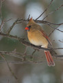
| 08/08/2015 10:37:41 AM | Mama Cardinalby DrakeComment by sidpixel: *Hello from Sid and the Critique Club*
A lovely bird study that meets the challenge well.
This is a very competent bird shot, with good sharp focus on the eye with good feather detail throughout. Your chosen aperture isolates the bird well from the background. I find the portrait orientation gives the bird too little space to look into with too much extraneous space above and below. Perhaps a landscape with the bird in the same position but with more space to look into might have worked better? There is a lot of twiggery but there's not a lot you could do about that.
I am here to give you my honest and critical opinion and there are a couple of relatively minor things I would have altered. I'm thinking it was probably snowing at the time? It's a shame it wasn't heavier but there are three white spots that stand out, I think they would have been better to be cloned out completely. The other is the twig immediately behind the end of the birds beak, I think again, I would have cloned this out too.
It's a nice exposure with good detail on the bird and the background highlight is not too overblown and distract, all in all a very good attempt, Sid |
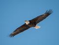
| 08/07/2015 06:51:28 AM | Soaring Bald Eagleby DrakeComment by sidpixel: *Hello from Sid and the Critique Club*
An appealing wildlife study.
I am naturally attracted to wildlife studies particularly action shots so towards that end the subject is appealing. It is a very competent shot with good focus but the lack of sharpness one of your commenters talk about may be due to cropping? Its a good exposure with plenty of detail throughout the birds plumage. I like the diagonal that the bird is placed on it adds a dynamic to the image.
Having identified what works for me I also need to give my honest opinion what doesn't work so well for me, the dominant blue of the sky overpowers the bird it would benefit from some desat. The bird is too large and too central, I would prefer to see him smaller and probably towards the lower right flying in to some empty space. The shutter speed is too high it feels far too static there is no sense of motion that you would get from a slower shutter speed with a little blur in the wingtips. I could easily imagine this hanging in a museum against a blue ceiling it would look very similar.
I would have expected your image to have scored better than it did but thanks for your submission and good luck for your future entries, Sid | | Photographer found comment helpful. |
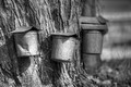
| 07/27/2015 09:23:21 AM | "You Name It"by DrakeComment by sidpixel: *Hello from Sid and the Critique Club*
A reasonable image that meets the challenge.
What a fun challenge this was, a very relaxed, easy to fulfil theme. So, thank you for introducing me to this process, something I have never seen before, does one tree really fill all those buckets?
In terms of the image itself your chosen wide open aperture has nicely softened background detail down so that we can concentrate on the tree itself. I find the lighting harsh and very contrasty I think it would have been better for you to have shot it in better light. The crop is a little inaccurate, with part of another bucket appearing right on the edge of the frame, and therefore distracting. Also your position includes a soft focus background shape clinging to the bucket, it would have been better to hide this behind the bucket.
You've received lots of novel suggestions for a title so in keeping with the rest of your commenters I really cannot let the side down can I, how about;
' birds air raid shelters'.
Well done, Sid | | Photographer found comment helpful. |
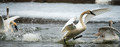
| 07/23/2015 04:22:54 PM | Water Danceby DrakeComment by sidpixel: *Hello from Sid and the Critique Club*
A great action shot that meets the challenge
Your element of choice for the challenge is water featuring a group of quarrelsome swans. I like the moment you have captured with the main bird in the process of taking to the air which also gives a feel for the additional element of air.
You have captured the main bird nice and sharp with a lovely wing shape giving it a real dynamic. Your title introduces a fun element in the suggestion that the bird is dancing on the water, its always good to make your viewer smile.
There are a couple of things that I would have done differently, the first is to use a slower shutter speed which would make the drops and splashed water less defined and obvious, I think 2 stops slower would be better, it would also introduce some motion blur in the wingtips which gives it more of dynamic feel. The other is the composition, I get the feel that your panoramic crop is done to include the bird on the left to show the aggression and its response of flight? As an image I think it would work better if he were excluded but you may well totally disagree with that.
All in all, a competent image that has been well appreciated here with a respectable score and several positive comments so well done, Sid | | Photographer found comment helpful. |
|
Showing 451 - 460 of ~3538 |
Home -
Challenges -
Community -
League -
Photos -
Cameras -
Lenses -
Learn -
Help -
Terms of Use -
Privacy -
Top ^
DPChallenge, and website content and design, Copyright © 2001-2026 Challenging Technologies, LLC.
All digital photo copyrights belong to the photographers and may not be used without permission.
Current Server Time: 06/26/2026 06:27:05 PM EDT.
|