| Image |
Comment |
| 06/06/2007 04:11:28 PM |
|
 Photographer found comment helpful. Photographer found comment helpful. |
| 06/06/2007 06:40:50 AM |
|
| Photographer found comment helpful. |
| 06/03/2007 09:40:06 PM |
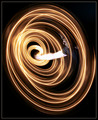
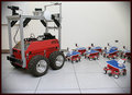
The Next Generation Is Hereby The_DentistComment by sfalice: Agreed. It's a six in my book as well.
The little 'robots' might be grouped in some discernible order. And this is nic picky, but since you have such a spare composition with lots of blank space, I think everything in the picture should work for a living. That means the electrical outlet should be in use (creatively) or concealed. Finally, it's hard for me to tell that the vignetting is part of the story?
Oh yes, I very much like the title. |
| Photographer found comment helpful. |
| 06/03/2007 05:49:16 PM |
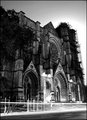
Reconstructionby The_DentistComment by Efergoh: I like this. It has an ominous feel for me, and makes me think of the Spanish Inquisition for some reason.
Conceptually it makes me think of the issues and black eyes that the Catholic church has faced over the centuries and even more specifically the issues with "alter boy scandals."
Only complaints I can come up with, and they are quite minor at that, are that I wish the arch on the left was as well lit as the arch on the right, and I would have cropped out the street at the bottom of the frame.
|
| Photographer found comment helpful. |
| 06/03/2007 11:55:16 AM |
|
| Photographer found comment helpful. |
| 06/03/2007 12:50:03 AM |
The Next Generation Is Hereby The_DentistComment by GKPhotos: Great idea. I think perhaps you didn't think the composition thru completely before shooting the pic.
The lighting is kinda flat. Additional light from one side or above might help.
Composition wise. With all the Ducky refrences on this site, put the 'baby' robots in formation behind the mother with perhaps one lagging far behind.
Keep up the good work. |
| Photographer found comment helpful. |
| 06/02/2007 02:07:17 PM |
The Next Generation Is Hereby The_DentistComment by Natasha: I would vote this a 6. It is technically very clean and sharp (except for the grey corners)-the contrast is good and the three main colours are strong. It definitely fits the challenge...
On the other side, it wouldn't go above a six because it doesn't excite me...this is purely personal preference, but I don't feel a connection to the picture-so 6 it is. |
| Photographer found comment helpful. |
| 06/02/2007 12:45:24 PM |
The Next Generation Is Hereby The_DentistComment by wavelength: 6, good concept, un-inspired lighting and composition, borders suck - just make it black.
improve: think out the composition and lighting. You might not have the equipment, but I can totally see this in a totally black room, with a hard light behind the big one and the small ones fanned out, creating shadows leading toward the camera, and a diffused light up front for fill and contrast. sweeeet.
Click Here for an example. |
| Photographer found comment helpful. |
| 05/28/2007 12:30:26 PM |
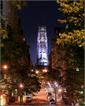
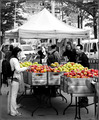
An Apple a Dayby The_DentistComment by The_Dentist: Well, a combination of a street photo with selective desat. I really like the feel of this kind of street photos, so was happy to find one that worked well with some color. However, I knew going in that such an image needs to really grab your eye in order to do well.
Thanks for the good comments, I am happy to have received a 10 and also a fav! |
| 05/28/2007 07:44:52 AM |
|
| Photographer found comment helpful. |
Home -
Challenges -
Community -
League -
Photos -
Cameras -
Lenses -
Learn -
Help -
Terms of Use -
Privacy -
Top ^
DPChallenge, and website content and design, Copyright © 2001-2026 Challenging Technologies, LLC.
All digital photo copyrights belong to the photographers and may not be used without permission.
Current Server Time: 05/06/2026 02:58:41 PM EDT.