| Image |
Comment |
| 06/27/2007 08:06:21 PM |
|
 Photographer found comment helpful. Photographer found comment helpful. |
| 06/27/2007 12:39:33 AM |
|
| Photographer found comment helpful. |
| 06/25/2007 08:40:50 PM |
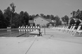
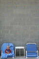
No swim, EATby veggieComment by Sheryll: I think the crop is a bit tight on the bottom and each side. Maybe a little pool in the shot would help. The bg doesn't give any wow imo but it does give it neg space to fit the challenge. |
| Photographer found comment helpful. |
| 06/25/2007 06:01:22 PM |
|
| Photographer found comment helpful. |
| 06/24/2007 04:13:31 PM |
|
| Photographer found comment helpful. |
| 06/24/2007 03:13:12 PM |
Pewterby veggieComment by TooCool: Fit's the challenge but it's too centered and kinda boring.
TC |
| Photographer found comment helpful. |
| 06/24/2007 01:47:32 AM |
|
| Photographer found comment helpful. |
| 06/23/2007 11:00:25 PM |
|
| Photographer found comment helpful. |
| 06/21/2007 08:03:25 PM |
|
| Photographer found comment helpful. |
| 06/20/2007 09:37:43 AM |
No swim, EATby veggieComment by dahkota: when you add that much negative space, there should be a reason for it. While the boy is cute and the bottom quarter of the image is well taken, the top half adds absolutely nothing. If there had been something of interest, I could understand why it wasn't cropped out. Really like the use of red on the child to make him stand out. |
| Photographer found comment helpful. |
Home -
Challenges -
Community -
League -
Photos -
Cameras -
Lenses -
Learn -
Help -
Terms of Use -
Privacy -
Top ^
DPChallenge, and website content and design, Copyright © 2001-2026 Challenging Technologies, LLC.
All digital photo copyrights belong to the photographers and may not be used without permission.
Current Server Time: 04/01/2026 03:54:07 PM EDT.