| Image |
Comment |
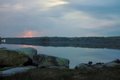
| 05/16/2007 04:16:02 PM |
Lightning across the lakeby eacComment by posthumous: I like the muted pastel colors. Even the lightning is pastel! The composition is okay, but not very interesting. I wish the lightning had worked harder for you and made some interesting shapes! :) |
 Photographer found comment helpful. Photographer found comment helpful. |
| 05/08/2007 02:41:10 PM |
|
| Photographer found comment helpful. |
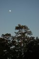
| 05/05/2007 11:49:30 AM |
Sunset and Moonriseby eacComment by emorgan49: There is something Zen like about the balance in this photo - It is soothing, the weight of the earth and the weightlessness of space. The off center moon, the centered tree. The warm tones of the earth, the cool tones of the sky. light above, dark below. |
| Photographer found comment helpful. |
| 05/05/2007 04:59:12 AM |
|
| Photographer found comment helpful. |
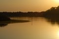
| 05/04/2007 02:00:07 PM |
Sunset on the Intercoastal Highwayby eacComment by emorgan49: First reaction, blah. Further look says ooh, nice spot too bad the photo is so blah. THird reaction, hey, I bet this could be seved with photoshop. how about turning it all sepia like this one?  or make it all golden like this? 
Work oh your post processing skills, photography today depends heavily on on the computer just like photography in the past required skill in the darkroom. Less messy these days. |
| Photographer found comment helpful. |
| 05/04/2007 01:51:41 PM |
Cosmo close upby eacComment by emorgan49: Ick - that is a face only a mother could love. the blue eye is creepy and the irregular markings on his face make him look distorted. Odd how one side of the photo is cool blues and the other warm yellows and browns - adds to the mis match. If this were in a challenge it would likly score low. YOU can see his charm and personality and livelness, but I cant see it in this portrait of him. |
| 05/04/2007 12:21:15 PM |
|
| Photographer found comment helpful. |
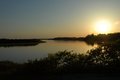
| 05/04/2007 02:16:45 AM |
Symmetry with wood and waterby eacComment by SaraR: I love the composition of this, and the subject is one that really appeals to me. There are a couple of things, in my view, that could have improved it even more:
1. The focus seems soft - two possible reasons spring to mind, either it is hand held at too low a shutter speed and a bit of camera shake has been introduced or you are focussing a little too far in to the photo. It may be worth spending a litle time reading up on hyperfocal distances - I struggle with it a bit myself, and am not the best person to explain! The effect of the soft focus is that the texture of the wood, which would add considerable ineterest, and increase the feeling of depth, has not been brought out.
2. I like the subdued colour palette, ad there are some wonderful shades in the water, but overall the photo lacks punch and would benefit from some levels adjustment (or if it has had some, a bit more tweaking), nothing major, just subtle adjustments.
Do bear in mind this is very subjective, and is just my opinion, so do take it with a pinch of salt! |
| Photographer found comment helpful. |
| 05/04/2007 01:39:09 AM |
|
| Photographer found comment helpful. |
| 05/03/2007 08:15:15 PM |
|
| Photographer found comment helpful. |
Home -
Challenges -
Community -
League -
Photos -
Cameras -
Lenses -
Learn -
Help -
Terms of Use -
Privacy -
Top ^
DPChallenge, and website content and design, Copyright © 2001-2026 Challenging Technologies, LLC.
All digital photo copyrights belong to the photographers and may not be used without permission.
Current Server Time: 07/16/2026 06:38:39 AM EDT.