|
|
|
Showing 451 - 460 of ~709 |
| Image |
Comment |
| 08/10/2004 07:08:57 PM | Stripesby melismaticaComment by wwwavenger: Melissa, I like this subject and I'm sorry to see it down here on page 27. I can't help but think had it been sharper it would have done a little better. |  Photographer found comment helpful. Photographer found comment helpful. |
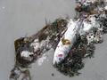
| 08/10/2004 01:14:39 PM | Nature's Balanceby melismaticaComment by blindjustice: I think I was served this very fish over at champlains later in the day.maybe it strayed too close to the water treatment plant. I guess if it were a local fish it would have known to go to narragansett town beach.
| | Photographer found comment helpful. |
| 08/10/2004 01:22:47 AM | |
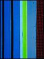
| 08/10/2004 01:10:26 AM | Stripesby melismaticaComment by melismatica: Originally posted by graphicfunk:
from the critique club:
Most important with these images are the colors. The form or lines add interest. personally, I would have repainted the green because it attracts so much attention on account of its almost chartruse quality. |
Another way of putting it is the small amount of green adds an interesting area of contrast--the very thing that caught my eye about the subject in the first place. Originally posted by graphicfunk:
Of course, replace it with what. Well, I would consider a subdued red to match the mesh or a dark blue. |
Of course, since this is a picture taken outside my apartment building of a window box that does not belong to me, a happy discovery of pattern and color rather than a contrived studio set-up, that would be besides the point.
Originally posted by graphicfunk:
The next step is to cash in your artistic eye by replicating the concept to move the viewer. |
That would be a set-up--something I was not interested in doing. Also, which viewer am I supposed to be concerned with moving? Inevitably, I'm taking pictures that I want to see. Originally posted by graphicfunk:
There are several ways to do this. For example: you do another take after sponging with water every other stripe or hosing the area with water. Most important is the play with light, straight light, reflected etc. In other words the pattern is your base, what can you possibly add to this image to make it stand out. Being a "blue challenge" I would have also considered a black light. |
The light was existing daylight. What I played with was the point of view. I took many shots of this window box until I happened upon an angle which eliminated the soil in the green plastic insert and reduced the window box to the colored stripes and red mesh. In processing, I rotated the image because I thought the vertical lines were more interesting then the 'natural' horizontal lines of the window box. All of this was very carefully thought out by me to achieve what I desired to see. Which should answer your last presumption. Sorry to sound ungrateful but you have approached your critiques of both my photos with the assumption that I did not have a set intention in mind when I made the pictures. I've been taking pictures for a lot of years and have a very definite idea of what I want to achieve. I don't mind if someone doesn't agree with my vision but I do mind when they presume that I don't posess vision. It may not harmonize with yours. Frankly, I don't care for your photos at all but I respect that you have a personal vision and when you make a picture you knew what you were making.
Originally posted by graphicfunk:
To conlude, you have a very good knack for finding unusual patterns and you need only expend the extra time to make it a unique image, not one that the next photographer can come by and easily duplicate. dan |
|
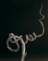
| 08/10/2004 12:47:12 AM | A Natural Twistby melismaticaComment by melismatica: Originally posted by graphicfunk:
From the critique club:
Always envision the shot in your minds eye and then do what ever is technically required. Normal shots and distant scenes differ greatly from the close up. A camera in auto mode, will never make this decision for you, so it is up to you to take care of this matter. The easiest way to do it is to make a test shot, check it in computer and then go back to finish.
dan |
First let me say that I appreciate the in-depth critique very much. I just have to add my own comments that:
a: I didn't really see this as a difficult to identify object---at least in that it is clearly of a fibrous, woody plant material. To me, it is quite obviously a twiggy section of vine. The title "A Natural Twist" would also suggest something of organic origins. I honestly don't see how peeling bark can be mistaken for anything else---certainly not metal, as your comments suggested.
b: I used manual settings to make this shot. I have yet to use the auto function on my camera. Through very careful placement of my lighting sources and exposure control, I intentionally created a black background from what was originally a white one. I have other shots with greater DOF but I thought the shallow depth of field added--well--- depth--to the image.
I appreciate all the suggestions that were made for 'improving' this image but in this case, I stand by my guns and respectively disagree. |
| 08/09/2004 10:25:23 PM | Stripesby melismaticaComment by graphicfunk: from the critique club:
These compositions fall inro the abstract realm. Most important with these images are the colors. The form or lines add interest. personally, I would have repainted the green because it attracts so much attention on account of its almost chartruse quality. Of course, replace it with what. Well, I would consider a subdued red to match the mesh or a dark blue.
The composition is very nice with the vertical lines running up and down and it is obvious that you have a sharp eye to find these interesting patterns. The next step is to cash in your artistic eye by replicating the concept to move the viewer. There are several ways to do this. For example: you do another take after sponging with water every other stripe or hosing the area with water. Most important is the play with light, straight light, reflected etc. In other words the pattern is your base, what can you possibly add to this image to make it stand out. Being a "blue challenge" I would have also considered a black light.
To conlude, you have a very good knack for finding unusual patterns and you need only expend the extra time to make it a unique image, not one that the next photographer can come by and easily duplicate. dan | | Photographer found comment helpful. |
| 08/09/2004 09:49:14 PM | A Natural Twistby melismaticaComment by graphicfunk: From the critique club:
Very nice composition because it starts center bottom, sweeps the left then coils to right and heads back and away to end at top right. This is a universal pattern associated with the serpent, the coil and certain bacteria.
The strenght of this picture is the unindentified article. My wild guess is that its texture appears to be metal. If it is metal I would guess it is the high tech barbed wire...yet I see a varying width which brings me back to first base. So the interesting shape and unknown item make this a very interesting study. It is a nice composition.
The shallow dof is the only major draw back. If we can easily identify the object, then the dof is not critical. If we can't, then the eyes want to examine every inch of the item and the viewers battle is quickly lost the moment they begin to study the image. It is more like a let down. Wow, what a shape? What is it? Let me see...uhmm focus is already gone past the middle coil on the right.
While the image is nice as is, this is an ideal subject which may be enhanced with a minor backlight, this would have added more mystery.
To conlude your idea was very nice, composition above average, but the execution of the quality, mainly the dof is the culprit. Always envision the shot in your minds eye and then do what ever is technically required. Normal shots and distant scenes differ greatly from the close up. A camera in auto mode, will never make this decision for you, so it is up to you to take care of this matter. The easiest way to do it is to make a test shot, check it in computer and then go back to finish.
dan | | Photographer found comment helpful. |
| 08/09/2004 06:59:49 PM | | | Photographer found comment helpful. |
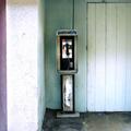
| 08/09/2004 03:19:37 AM | 50 Centsby melismaticaComment by Pedro: I agree with Kylie. more like this. just for fun, try cropping out the purple, thereby putting the booth on one of the 'third' lines. then boost the hell out of the contrast :) this has the potential to be very very cool, instead of just nicely cool.
P | | Photographer found comment helpful. |
| 08/08/2004 08:14:22 PM | A Natural Twistby melismaticaComment by Imagineer: Striking shape (clematis?) and well composed, but this really needed to be sharp with full DOF as the furthest part of the subject is as interesting as the nearest. | | Photographer found comment helpful. |
|
Showing 451 - 460 of ~709 |
Home -
Challenges -
Community -
League -
Photos -
Cameras -
Lenses -
Learn -
Help -
Terms of Use -
Privacy -
Top ^
DPChallenge, and website content and design, Copyright © 2001-2026 Challenging Technologies, LLC.
All digital photo copyrights belong to the photographers and may not be used without permission.
Current Server Time: 07/17/2026 11:18:24 AM EDT.
|