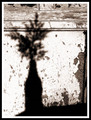
Still Life With Bottleby
melismaticaComment by Aghris: Greetings from the Critique Club
First impression and overall look:
My first impression on this photo is that it is very classical, composition wise. You used the rule of thirds well on the vertical axis, and the weight of the image is nicely distributed. There is a good balance between the heavy part on the left, and the quiet part on the right, although I'm not sure if you should have left the bit of wood on the right in.
On the horizontal exis, I feel that the weight of the image is slightly downwards and I think you could have included more of the ground. As it is now, the dark part of the ground is not adding anything to the image and maybe you should have included a bit more of it.
I like the texture on the wall, and the sepia tones are a good choice for this image. It sets the mood well.
Technical and post processing:
Not much to say here. Technically it all seems well in order. You didn't go overboard in post processing, which adds to the nonstalgic feel to the image. Personally I would choose either a black or white border. Having them both there does not add anyting.
Meeting the challenge:
Well, it's a shadow, so nothing to say here.
How to raise your score:
There isn't much of a wow factor in this image. Although it's technically all fine, there isn't anything that makes you come back to this photo to have another look. I realise that's the whole idea, but it doesn't make the voters of DPC give you a high score.