DPChallenge: A Digital Photography Contest You are not logged in. (log in or register
 
Browse Settings
Currently viewing:
Registered UserSonifo

Show comments:

Per page:

Order:

Comments:


Comments Received by Sonifo
Pages:   ... [468] [469] [470] [471] [472] [473] [474] ... [544]
Showing 4701 - 4710 of ~5439
Image Comment
Meet Spot, my pet square.
01/27/2003 07:18:31 PM
Meet Spot, my pet square.
by Sonifo

Comment by Cub:
Neat!! I like the colors and lighting!! Cub
Photographer found comment helpful.
Meet Spot, my pet square.
01/27/2003 02:18:11 AM
Meet Spot, my pet square.
by Sonifo

Comment by ChrisW123:
Tweak them colors! The dead space bothers me on this.
Photographer found comment helpful.
Big Horn Mountains
01/24/2003 07:04:42 PM
Big Horn Mountains
by Sonifo

Comment by timj351:
Critique Club critique.

Two things jumped out at me initially. The slightly over saturated colors and the black distracting border. The colors, particularily the blue channel, appear over saturated which takes away from the naturalness of it. This may have been intentional or a calibration problem on your monitor. The black border really commands attention which draws my attention away from the photo where it should be. The border should support the photo not compete with it. Maybe a thin dark inner border of green, blue or even black with a wider outer border in a lighter color of ocre, cream, or white would be appropriate. I like the wider cropping, it helps to convey the sense of a wide open space. I'm not sure about the perfectly centered horizon line, I think I would prefer to see it raised so as to show more of the foreground with the beautiful colors and features. If there were some really interesting cloud formations Than you could have focussed on that but as it is, with only a solid blue color, it isn't really necessary to show that much of it when you can, instead, show off more of the land which has the interesting details. The photo appears properly exposed with the right amount of sharpness and clarity. It looks like a beautiful area to photograph. Nice job.

Tim

Photographer found comment helpful.
Feet
01/23/2003 10:28:20 PM
Feet
by Sonifo

Comment by webigale:
soo cute!
Photographer found comment helpful.
Silly Boy
01/23/2003 07:17:11 PM
Silly Boy
by Sonifo

Comment by BAMartin:
Critique Club Critique

(1) COMPOSITION (CONTENT) The composition of the photograph is one of the best things about it. The diagonal placement of the young man is very interesting compositionally. The fact that you are looking down at him makes his face much larger than any other part of him and thus take on a prominence that it normally would not.

(2) BACKGROUND The background is rather plain, and because of this the photo has an uncluttered look to it. Nice selection for this partcular photo. I do not know what that little thing in the corner over his head is, but it is a little bit distracting. Maybe you could have cropped the photo just a little tighter and gotten rid of it.

(3) CAMERA WORK ,TECHNICAL Exposure seems a little bright on the left side of his face and hair. It looks as though this was taken in natural light. Some wonderful details are lost in the highlight areas. I am wondering if that light could have been muted a little with some tissue paper or muslin cloth.

(4) DIGITAL PROCESSING ,TECHNICAL Black and white was a good choice for this photograph. You have very good tonal range here, all the way from whitest white to blackest black.

(5)MEETING THE CHALLENGE This photo does a very good job of meeting the challenge. I love the look on his face, the way he is wrinkling up his nose and even the sparkle in his eye.

(6) MY OPINION ON THE PHOTO This is one of those photos that you will treasure when he is older. It does have a little "snapshot" feel to it, but that does not seem to take anything away from the photograph.
Photographer found comment helpful.
Big Horn Mountains
01/19/2003 06:43:27 PM
Big Horn Mountains
by Sonifo

Comment by PTLParsons:
From brown flat lands to snow covered mountains. Sounds like a song. And as pretty as one. I love it. Beautiful sky. Love the way it's cropped and beutiful focus with great clarity. We done for a 9.
Photographer found comment helpful.
Big Horn Mountains
01/19/2003 02:02:45 PM
Big Horn Mountains
by Sonifo

Comment by mcrael:
The scene is very pretty, but colors look over-saturated. I'd prefer to see this photo in larger format.
Photographer found comment helpful.
Lematoe Juice
01/19/2003 09:48:10 AM
Lematoe Juice3rd Place
by Sonifo

Comment by Azrifel:
~~~~Critique Club Comment~~~~

Composition (content)

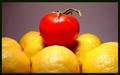
Good composition, it builds up to the tomatoe by the use of several composition tools.
* The lemons in front seem to point at the tomatoe and create an angle that leads into the frame.
* All the lemons optically seem to form a mountain with the tomatoe on top.
* The creative use of aperture works out perfect, only the area where the tomatoe is in seems to be in the field of focus, and the tomatoe is pin sharp.
* The color contrast between the tasteful (this looks like a healty, ripe tomatoe and those are tasteful) red of the tomatoe and the nice saturated yellow of the lemons is excellent.
* good choice of background, see item on that.

So any other composition rule like the rule of thirds is out of the question here, it wouldn't add anything.

The drops of water on the tomatoe are a nice touch, combined with the excellent lighting it just wants to make you grab it and prepare it to eat it. :)

Background
The background is a boring color/grey, you don't want to look at that, because the foreground is more interesting. Choosing color would have taken something away from the red/yellow balance that makes this picture so appealing to the eye. Black or white would be distracting in my opinion.

Camera Work (Technical)
Good use of aperture, excellent exposure, good focus and sharpness.

Digital Processing (technical)
The saturation is very good, sharpness good.

The image could be saved at a higher quality level, because it is only 55kb of the 150 allowed. That would improve the grain/noise in the background as it seems visibly affected by jpeg compression. It would also take away the jpeg noise around the greens on top, a much smoother relation between background and foreground. It doesn't distract here, but it is something to keep in mind.

I personally don't like the big black border. The color is not in balance with the image and it is also big in relation to the image. I'd like a thin line more than this. (It seems to be very dark green btw, taken from the shadow area of the stem of the tomatoe I guess)

My opinion
Very good.

Message edited by author 2003-01-19 09:50:20.
Photographer found comment helpful.
Lematoe Juice
01/18/2003 10:55:30 AM
Lematoe Juice3rd Place
by Sonifo

Comment by JEM:
Congratulations Sonja - Ol' Michael must be very proud. This consistent excellence shows the mob that you are not just another tootsie roll from the Wyoming countryside.
Photographer found comment helpful.
Big Horn Mountains
01/18/2003 05:39:38 AM
Big Horn Mountains
by Sonifo

Comment by Marklane:
Superb panaramic image. I think the frame might be a bit heavy though?
Photographer found comment helpful.
Pages:   ... [468] [469] [470] [471] [472] [473] [474] ... [544]
Showing 4701 - 4710 of ~5439


Home - Challenges - Community - League - Photos - Cameras - Lenses - Learn - Help - Terms of Use - Privacy - Top ^
DPChallenge, and website content and design, Copyright © 2001-2025 Challenging Technologies, LLC.
All digital photo copyrights belong to the photographers and may not be used without permission.
Current Server Time: 09/19/2025 12:45:51 PM EDT.