| Image |
Comment |
| 01/17/2008 08:31:08 AM |
Yeggsby higgledyComment by Tez: Interesting... i don't think I like the cropping at the top though, how it missed the ends of the branches. I like the colours though. Focus is good, comp is good... it just doesn't do enough for me. 1 more thing: is that sand? |
| 01/16/2008 07:04:36 PM |
|
| 01/16/2008 05:45:21 PM |
|
| 01/16/2008 12:15:27 AM |
|
| 11/13/2007 08:12:05 PM |
The Art of Seductionby higgledyComment by alexzen: great lighting. Nice subtle border. Centered composition maybe could be improved upon, but given where the light is coming from I think you did a great job. |
| 11/10/2007 08:09:51 PM |
|
| 11/07/2007 11:06:15 AM |
|
| 11/07/2007 08:50:34 AM |
|
| 10/30/2007 11:48:00 PM |
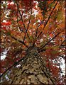
Big Redby higgledyComment by Yo_Spiff: Good depth of field, nice texture, I think the colors could have been bumped up a touch more for greater impact. |
| 10/30/2007 12:24:19 AM |
Big Redby higgledyComment by rdebruyn: Even though there are so many leaves and branches, there is a symetry to it. There was an earlier shot of a tree that I didn't bother voting on since the branches went in all directions and were more pronounced. That picture was too busy, and this one is quite nice. |
Home -
Challenges -
Community -
League -
Photos -
Cameras -
Lenses -
Learn -
Help -
Terms of Use -
Privacy -
Top ^
DPChallenge, and website content and design, Copyright © 2001-2026 Challenging Technologies, LLC.
All digital photo copyrights belong to the photographers and may not be used without permission.
Current Server Time: 07/16/2026 12:41:32 AM EDT.