DPChallenge: A Digital Photography Contest You are not logged in. (log in or register
 
Browse Settings
Currently viewing:
Registered UserGreetmir

Show comments:

Per page:

Order:

Comments:


Comments Received by Greetmir
Pages:   ... ... [97]
Showing 351 - 360 of ~966
Image Comment
A Primarily Peaceful Spring
04/30/2007 01:13:38 AM
A Primarily Peaceful Spring
by Greetmir

Comment by Scholten:
Beautiful, vibrant color. Excellent detail and focus. And the pie-shaped approached is creative and refreshing!
Photographer found comment helpful.
Hybrid Tulip
04/28/2007 10:42:02 PM
Hybrid Tulip
by Greetmir

Comment by DrAchoo:
blown. ;)

Message edited by author 2007-04-28 22:43:43.
Photographer found comment helpful.
Hybrid Tulip
04/28/2007 07:10:17 PM
Hybrid Tulip
by Greetmir

Comment by Sting11165:
(copied from forum)

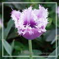
I like the subject -- I'm a sucker for flower shots myself, and this tulip is strange looking in a neat way. The lighting seems good and the small depth of field (blurring the background) is appropriate for the type of image. The semi-transparent border (with the stem going across it) is very appropriate -- I was actually thinking of doing a similar border on one of my own images lately.

Compositionally, a centered flower makes sense, although the petals are symmetric but not quite symmetric -- that bothers me a little bit. Nothing major though.

Saturation seems good, although I'd like to see a little more and compare -- it might help a bit.

Three major complaints though:
1. Focus. The front of the flower is in focus, the back isn't. It detracts a lot from the quality of the image since there is a lot of detail in the back of the flower. Actually, looking at it, the flower looks almost superimposed on the background -- did you use a soft focus filter or is it just my eyes playing tricks on me?
2. Blown highlights. The tips of the petals are blown to full white, as far as I can tell. This is one of those cases where shooting raw might help and decreasing your exposure slightly to avoid blowing the highlights.
3. Noise. The image has a decent amount of noise to it, especially in the background. Noise in the flower doesn't show too much but the background noise hurts the image. The good news is that neatimage is free to download, and there are a host of other programs that would clear that up yet leave the detail in the flower.

Obviously, 1 and 2 need to be addressed when the image is taken, and 3 could be fixed now. The good news is it really isn't the subject and composition, all of that is good. Just a little more aperture and a little less exposure and you'd have a great file to process. Overall, a good image and good presentation, just a few minor things to fix to make it a great image.
Photographer found comment helpful.
Dreams of Refreshment
04/28/2007 02:46:19 PM
Dreams of Refreshment
by Greetmir

Comment by Wink:
Nice job on the editing, very smoothly done. It must remind some of the mind altered states of the 60's, but clearer. Too bad about the DQ.
Photographer found comment helpful.
Dreams of Refreshment
04/28/2007 02:35:23 PM
Dreams of Refreshment
by Greetmir

Comment by littlegett:
This shot has so much WOWOWOWWOWOW potential. I really love the glass, the effects are just mind bogglingly fantastic. The base has to be my absolute favorite part Perfectly oozy. (-;. The Rim is also very fantastic. But, I think you went overboard with the lemon. I would love to see a perfectly intact lemon on this warped glass. I think also keeping the plastic wrap on the inside edge of the lemon would be great and the effect lessens as it goes to the outside.

I really enjoy the green and yellow I think the shades and brightnesses are fantastic, however, I am wondering what if the background was brighter? I would love to see this with all black, and all white variants to really see how the effect changes.

You did a great job here... Just pushed the rules to far and they broke 6-; Nice image (-; and rules are made to be broken.
Photographer found comment helpful.
Exploring
04/28/2007 10:56:27 AM
Exploring
by Greetmir

Comment by purpleflutterby13:
That's very cute!

I would've been tempted to cut off some space on the left, and leave a lot more empty space on the right and at the top to really give the viewer a sense of movement and exploration.

The colours are nice, but the goat could do with some sharpening.
Photographer found comment helpful.
Hybrid Tulip
04/27/2007 09:02:13 PM
Hybrid Tulip
by Greetmir

Comment by sherpet:
This is just Awesome, Greetmir, actually a very pleasing image in everyway, and just so good, I must add it to my favorites.....
This should be a DPC print, IMO.....
Photographer found comment helpful.
Hybrid Tulip
04/27/2007 07:47:11 PM
Hybrid Tulip
by Greetmir

Comment by Monique64:
Thought I would add a comment for you. Love the shot. I feel that the flower is too high up in the photo, needs to be a bit more central. Some of the white ends of the flower is glaringly white. Other than that it's a great photo and subject. I like the border and the way that the stem sits in front of it.
Photographer found comment helpful.
The DPChallenge Votes Start Rolling In
04/27/2007 01:06:11 PM
The DPChallenge Votes Start Rolling In
by Greetmir

Comment by Haneck:
Perhaps a little bit too much grain for me, but a HILARIOUS expression!!
Photographer found comment helpful.
Hybrid Tulip
04/27/2007 10:32:48 AM
Hybrid Tulip
by Greetmir

Comment by dahkota:
lovely colors. Not too hot on the framing but I rarely like frames anyway. Some of the detail is blown out on the tulip - just slightly bothersome.
Photographer found comment helpful.
Pages:   ... ... [97]
Showing 351 - 360 of ~966


Home - Challenges - Community - League - Photos - Cameras - Lenses - Learn - Help - Terms of Use - Privacy - Top ^
DPChallenge, and website content and design, Copyright © 2001-2025 Challenging Technologies, LLC.
All digital photo copyrights belong to the photographers and may not be used without permission.
Current Server Time: 09/06/2025 12:41:20 PM EDT.