| Image |
Comment |
| 02/23/2008 10:29:53 PM |
|
 Photographer found comment helpful. Photographer found comment helpful. |
| 02/22/2008 08:23:27 PM |
|
| Photographer found comment helpful. |
| 02/21/2008 04:19:16 PM |
|
| Photographer found comment helpful. |
| 02/21/2008 03:25:59 PM |
|
| Photographer found comment helpful. |
| 02/21/2008 02:53:08 PM |
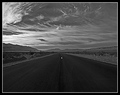
Panamint Valley Road at Sunriseby EstimatedEyesComment by keibo84: oh wow, great sky. The one thing i would have done different would be to place the center lines closer to the bottom of the frame. As it stands now it seems like a little too much empty space |
| Photographer found comment helpful. |
| 02/20/2008 01:32:51 PM |
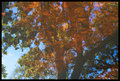
Reflectionsby EstimatedEyesComment by slaakso: I love colors and the painterly look of the leaves. Has a muted look of a wash over the top and might not let the image pop as much as it could. I really, really like this photo so I don't know if I'd change it or not. As for the reflections without mirrors challenge I would have voted highly. |
| Photographer found comment helpful. |
| 02/20/2008 01:18:36 PM |
Reflectionsby EstimatedEyesComment by smilebig4me1x: love it love it love it! this is a kewl scenic (sorta) abstract...very unique.when i first looked at it my frist thought was you needed some contrast..NOT.I now think that would totaly mess this up. very nicely done!
~~Cher~~ |
| Photographer found comment helpful. |
| 02/20/2008 12:19:34 PM |
|
| Photographer found comment helpful. |
| 02/19/2008 11:56:34 PM |
PB&Jby EstimatedEyesComment by Yo_Spiff: Not quite sharp in the fine details. If this was handheld, a tripod may have been in order. |
| Photographer found comment helpful. |
| 02/19/2008 09:52:18 PM |
|
| Photographer found comment helpful. |
Home -
Challenges -
Community -
League -
Photos -
Cameras -
Lenses -
Learn -
Help -
Terms of Use -
Privacy -
Top ^
DPChallenge, and website content and design, Copyright © 2001-2026 Challenging Technologies, LLC.
All digital photo copyrights belong to the photographers and may not be used without permission.
Current Server Time: 07/18/2026 03:43:27 AM EDT.