| Image |
Comment |
| 06/10/2003 04:21:35 AM |
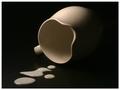
Please? Don't cry ...by e301Comment by breezy: Great picture - I like the simplicity and the lighting - there's a lot of darkness and shadow that evokes a little bit of emotion out of me :) Cute title too. |
 Photographer found comment helpful. Photographer found comment helpful. |
| 06/10/2003 01:23:31 AM |
Please? Don't cry ...by e301Comment by qachyk: More natural looking than many spilled f00 shots. The milk inside the pitcher is tough to see due to colour of the pitcher, but the trade-off there of course is the use of a contrasting colour against the background. Lighting is interesting although given the choice of a set of contrasting objects perhaps giving a little more light to the right side of the pitcher would've been a little better? I don't dislike it as is. |
| Photographer found comment helpful. |
| 06/09/2003 11:47:45 PM |
Please? Don't cry ...by e301Comment by frisca: i really like your lighting on this. the milk is prominent but the composition is the star with its simplicity and elegance. Well done. |
| Photographer found comment helpful. |
| 06/09/2003 11:45:36 PM |
|
| Photographer found comment helpful. |
| 06/09/2003 05:27:19 PM |
Please? Don't cry ...by e301Comment by scab-lab: Love the dramatic lighting here, could use a little more fill light on the milk drops themselves, a little brighter and it makes it more special. |
| Photographer found comment helpful. |
| 06/09/2003 01:15:11 PM |
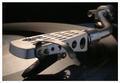
In a previous existenceby e301Comment by bod: One of my favs in this challenge. Indi makes some good suggestions, more space at the bottom especially, but it's still great as it is.
You're on a roll, keep it up! |
| Photographer found comment helpful. |
| 06/09/2003 01:52:34 AM |
In a previous existenceby e301Comment by indigo997: Very nice shot, and a great score to go along with it!
For such a cold subject, you did well to give it life and interest. I do like the lighting and angle you've created. Nice use of dof. Although the color doesn't really add much to the shot, I'm glad you left it. It's sort of a natural b&w shot.
I think it seems a tad flat or grey. The background seems like it should be darker maybe? The crop also seems a little too tight on the bottom and right side. I dunno. It's great as it is so I don't really have a lot of suggestions on improvements... just alternatives. It's a very good technical shot that obviously had enough interest with the viewers to score well. You took a very nice photo of a very ordinary object. Something that not many can do.. and few can do well. Congratulations. |
| Photographer found comment helpful. |
| 06/08/2003 10:30:41 PM |
In a previous existenceby e301Comment by dsidwell: I suppose you mean "in a PREVIOUS existence?" No matter. I love the point of view here,and your lighting could not be better. Super work! |
| Photographer found comment helpful. |
| 06/08/2003 09:03:41 PM |
|
| Photographer found comment helpful. |
| 06/08/2003 08:53:33 PM |
|
| Photographer found comment helpful. |
Home -
Challenges -
Community -
League -
Photos -
Cameras -
Lenses -
Learn -
Help -
Terms of Use -
Privacy -
Top ^
DPChallenge, and website content and design, Copyright © 2001-2026 Challenging Technologies, LLC.
All digital photo copyrights belong to the photographers and may not be used without permission.
Current Server Time: 07/24/2026 06:25:09 AM EDT.