| Image |
Comment |
| 10/04/2007 01:05:21 AM |
|
 Photographer found comment helpful. Photographer found comment helpful. |
| 10/04/2007 12:52:03 AM |
|
| Photographer found comment helpful. |
| 10/04/2007 12:42:11 AM |
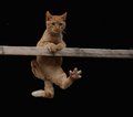
October Day 2by emily212Comment by thomaspeople: It's done very well. Kitty doesn't look too happy though.
I've done a few like this, where I didn't want the background and blacked it out. My only suggestion would be to finish with a soft edged brush with the burn tool around the very edge of the subject (in this case, kitty) and maybe use a small blur brush as well on the outline - to smooth out the edges whee the cats body meets the darkness. I'm not great at it yet, but I'm getting better. The pro's on this site may have a better way, but I don't know it yet.
This is a very good picture though - take my comments with a grain of salt. |
| Photographer found comment helpful. |
| 10/02/2007 11:40:12 PM |
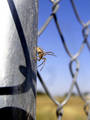
Study of a Spiderby emily212Comment by Moatz: It makes me wonder what is beyond the bottom of the frame, he looks like he is getting ready to attack something down there! I also really like the fence in the picture, it is very refreshing from a flower or such. DOF is great, good variety of colors, just enough contrast between the fence and the spider to make him stand out. Good job! |
| Photographer found comment helpful. |
| 10/02/2007 10:10:42 PM |
Study of a Spiderby emily212Comment by DJWoodward: If this is a study of a spider why does it fill so little of the image space? Get in there and fill the frame. Did you clone something out from the center of the image? There seems to be a discoloraton below and to the right of the spider. |
| Photographer found comment helpful. |
| 10/02/2007 02:13:09 PM |
Study of a Spiderby emily212Comment by CapeSail: I like the DOF on this, I think a tighter crop would have worked better. The bright portion in the top left side pulls your eye away from the spider. |
| Photographer found comment helpful. |
| 10/01/2007 08:31:59 AM |
Study of a Spiderby emily212Comment by Melethia: Oh, I like this. Now if I could only explain why, exactly, I like this... I love the fence as the supporting structure to the spider's "pose" - I like the defensive/sensing pose of the subject. I love the shadow of the links on the post and the fact you caught the spider in just the right place. And of course the sky is a nice blue. |
| Photographer found comment helpful. |
| 10/01/2007 01:45:08 AM |
|
| Photographer found comment helpful. |
| 09/18/2007 01:14:30 PM |
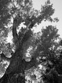
B&W Day 11by emily212Comment by Budya: As in the previous photo, I would have love to see a bit ore contrast. I love the angle here! Very nice! |
| Photographer found comment helpful. |
| 09/18/2007 01:13:17 PM |
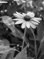
B&W Day 10by emily212Comment by Budya: I'd think a bit more contrast will make the daisy really pop. I wonder if a horizontal crop (getting rid of the stems) would help my eye to focus on the daisy. |
| Photographer found comment helpful. |
Home -
Challenges -
Community -
League -
Photos -
Cameras -
Lenses -
Learn -
Help -
Terms of Use -
Privacy -
Top ^
DPChallenge, and website content and design, Copyright © 2001-2026 Challenging Technologies, LLC.
All digital photo copyrights belong to the photographers and may not be used without permission.
Current Server Time: 06/24/2026 11:27:09 AM EDT.