| Image |
Comment |
| 05/21/2007 06:42:49 AM |
|
 Photographer found comment helpful. Photographer found comment helpful. |
| 05/21/2007 06:33:26 AM |
|
| Photographer found comment helpful. |
| 05/21/2007 12:16:00 AM |
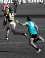
AFL Power vs Tigers - Good Markby SomeamateurComment by Efergoh: Too much color, I think.
Selective color/desaturation is funny that way. There is a fine line between wow and overdone. This isn't over the top and gawdy mind you, but it is a bit much...not subtle. |
| Photographer found comment helpful. |
| 05/17/2007 12:36:23 AM |
High Speed Actionby SomeamateurComment by khdoss: Hello from the Critique Club
First Reaction was nice action shot.
I like that he is in air and nice motion blur.
Technically
Considering you were in a gym shooting with a 4.5 lens and at ISO 1600 I am surprised this is not grainy. The lighting in a gym is usually bad and flash really helps.
Composition is ok, It's hard when you are shooting a sports shot to check out the background and the 2 people take away from the shot.
Since this was basic editing not much you could do.
Keep shooting and having fun!
Karen |
| Photographer found comment helpful. |
| 05/10/2007 07:04:50 PM |
Nautical Directionsby SomeamateurComment by dr rick: Greetings from the Critique Club
A directional sign out in the ocean is a promising idea that could result in an interesting surreal image. But here, although technically well done, the sign is just so large in proportion to the rest of the photo that it looks like what it is: a photo of a sign pasted on an ocean scene. To me, anyway, it doesn't really convey any special meaning.
Even without that issue, the composition is rather weak. The nearly centered horizon line is rather boring, and the large expanse of beach in the foreground is rather distracting from the idea here. I suggest cropping off the bottom third, putting the horizon on a "rule-of-thirds" line and focusing the viewer's attention more on the sea. The sky isn't bad, but it would be nicer if the clouds were brighter. And I think that this might work better in a horizontal format.
Overall, a worthy experiment for an Expert Editing Free Study. It's not really ribbon quality, but it does certainly show off your creativity, which is a big part of the appeal of DPChallenge. |
| Photographer found comment helpful. |
| 05/09/2007 03:04:19 PM |
|
| Photographer found comment helpful. |
| 05/09/2007 01:03:14 PM |
|
| Photographer found comment helpful. |
| 05/09/2007 10:52:37 AM |
|
| Photographer found comment helpful. |
| 05/06/2007 02:44:39 PM |
|
| Photographer found comment helpful. |
| 05/02/2007 08:42:13 PM |
Nautical Directionsby SomeamateurComment by Techo: A very nicely capture beach scene. Though the stake looks unnaturely pasted in and out of place. The idea is very interesting, just wondering if there was some other way to implement it in the image. |
| Photographer found comment helpful. |
Home -
Challenges -
Community -
League -
Photos -
Cameras -
Lenses -
Learn -
Help -
Terms of Use -
Privacy -
Top ^
DPChallenge, and website content and design, Copyright © 2001-2026 Challenging Technologies, LLC.
All digital photo copyrights belong to the photographers and may not be used without permission.
Current Server Time: 07/22/2026 04:14:56 PM EDT.