| Image |
Comment |
| 12/03/2003 04:40:45 PM |
|
| 12/03/2003 12:46:23 PM |
Where does it all go?by chickadeeComment by TooCool: Nice conceptually and nice composition, but something about it doesn't work for me. I think it's the lighting. Also focus is off.
TC |
| 12/03/2003 08:23:58 AM |
Where does it all go?by chickadeeComment by Dave Gordon: The lighting is obviously arranged to make a point and focus in on some of the bills, but the heavy shadows end up being more distracting than enhancing. |
 Photographer found comment helpful. Photographer found comment helpful. |
| 12/03/2003 04:22:05 AM |
Where does it all go?by chickadeeComment by Natator: Frightning! I have my Optus and Telstra bill here and my Commonwealth statement hates them! Did you sneak into my study? The desk lamp lighting here gives it a good overall effect. I like it. |
| Photographer found comment helpful. |
| 12/03/2003 01:19:56 AM |
|
| Photographer found comment helpful. |
| 07/22/2003 10:03:30 PM |
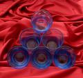
Geometryby chickadeeComment by miller: I think a little more contrast might help the subject stand out a little more. Interesting composition, but the image seems flat. I can see what you're going for with the background, but I think it's a little busy. |
| Photographer found comment helpful. |
| 07/21/2003 06:43:16 AM |
Geometryby chickadeeComment by asitv: try filling the glasses with water and other one with a small candel in each glass with that only for lighting. A good shot though!! |
| Photographer found comment helpful. |
| 07/19/2003 08:09:30 PM |
Geometryby chickadeeComment by ScottK: Good effort, but the color's a bit muted. I'm assuming you were trying to keep reflections out of the glass. The angle feels a little odd - it leaves a lot of background at the top that keeps drawing my attention away from the glasses. A good idea that you might have been able to improve a little with some more work. |
| Photographer found comment helpful. |
| 07/19/2003 07:15:35 PM |
Geometryby chickadeeComment by banmorn: Super lighting, nice billowing in the backdrop...just have a problem with the color, red might not have been the best choice.....hmmmm....yellow might have work for me. |
| Photographer found comment helpful. |
| 07/19/2003 03:10:43 PM |
Geometryby chickadeeComment by anderaaron: very nice. the only thing I would think to sudgest would be to use a yellow backdrop for the complementary colors, but very nice 8 |
| Photographer found comment helpful. |
Home -
Challenges -
Community -
League -
Photos -
Cameras -
Lenses -
Learn -
Help -
Terms of Use -
Privacy -
Top ^
DPChallenge, and website content and design, Copyright © 2001-2026 Challenging Technologies, LLC.
All digital photo copyrights belong to the photographers and may not be used without permission.
Current Server Time: 07/16/2026 09:02:31 AM EDT.