| Image |
Comment |
| 08/07/2007 12:53:12 PM |
|
 Photographer found comment helpful. Photographer found comment helpful. |
| 08/06/2007 10:16:31 PM |
|
| Photographer found comment helpful. |
| 08/06/2007 08:32:16 PM |
|
| Photographer found comment helpful. |
| 08/06/2007 08:31:35 PM |
|
| Photographer found comment helpful. |
| 08/06/2007 06:58:00 PM |
Vrrrooommmby MelonMusketeerComment by JerseyGenie: Not only does it work (how you explained it) but it also works so very well color-wise too: the color of the wind-whipped garage and the biker and the post give big pops of blue which is further accented by the little whisps of blue in the background. Nice job. And enjoyed the story too. |
| Photographer found comment helpful. |
| 08/06/2007 09:40:20 AM |
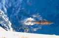
Happy Porposeby MelonMusketeerComment by Germaine: Congratulations on mastering the exposure on these shots and sharing with us. Good color and blur, but IMNSHO the white strip at the bottom is distracting. I'd crop it out. |
| Photographer found comment helpful. |
| 08/06/2007 09:33:07 AM |
|
| Photographer found comment helpful. |
| 08/06/2007 09:32:22 AM |
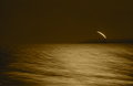
Lighthouse in the Wind-1by MelonMusketeerComment by annig: I like this one a lot, Waddy! the tilted horizon gives the impression of being in the cockpit and "gimbling" (is that a word btw?? :)
nice use of the camera while you bob around out there in the vast blue sea!
~Anni |
| Photographer found comment helpful. |
| 08/06/2007 09:16:47 AM |
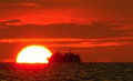
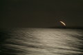
Lighthouse In the Windby MelonMusketeerComment by bob350: In the original, the tilted horizon comes across to me not as a flaw but rather as a choice that imparts a sense of a boat pitching about in windy conditions. It is probably one of the few circumstances in which a tilted horizon might be just fine. The nearly black and white tones in the original give a stronger sense of wildness.
In this version, the sepia and level horizon seem to tone down the emotional impact, which makes it easier to pay more attention to the interesting lighthouse beam (reminds me of a blast of burning propane from a refinery). I appreciate being able to see the earlier version. I like both of them.
Excellent example of a good use for "sharpless". |
| Photographer found comment helpful. |
| 08/06/2007 08:33:00 AM |
|
| Photographer found comment helpful. |
Home -
Challenges -
Community -
League -
Photos -
Cameras -
Lenses -
Learn -
Help -
Terms of Use -
Privacy -
Top ^
DPChallenge, and website content and design, Copyright © 2001-2026 Challenging Technologies, LLC.
All digital photo copyrights belong to the photographers and may not be used without permission.
Current Server Time: 07/23/2026 11:32:31 AM EDT.