| Image |
Comment |
| 11/18/2007 01:57:21 PM |
|
 Photographer found comment helpful. Photographer found comment helpful. |
| 11/17/2007 11:04:18 PM |
|
| Photographer found comment helpful. |
| 11/14/2007 09:00:49 PM |
|
| Photographer found comment helpful. |
| 11/14/2007 07:49:46 PM |
|
| Photographer found comment helpful. |
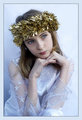
| 11/14/2007 06:39:15 PM |
Lttle Angel 2by JedusiComment by surfdabbler: Really nice portrait. I love the cooler tones - they really make the scene shine. The posing is really good too. Did you control the posing yourself, or is she a great model? My only suggestion would be to bring out her eyes more. They are already very striking, and could really be a knockout if they were adjusted a little. |
| Photographer found comment helpful. |
| 11/14/2007 01:23:44 PM |
|
| Photographer found comment helpful. |
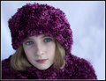
| 11/14/2007 12:48:14 PM |
Ice Princessby JedusiComment by Nusbaum: I love this portrait. The cool tone, blue background and deep blue eyes work perfect and add a nice winter feeling. The lighting is just perfect as well. Nothing bad to say or recommendation to make. |
| Photographer found comment helpful. |
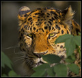
| 11/13/2007 03:21:26 AM |
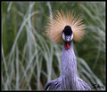
Natural Camouflage . .by JedusiComment by h2: Just stumbled upon this... very good detail, color and DOF. Feathers above his eyes are a tad dark, besides that the tones are very good. A square format would work better here, as he looks straight forward and there is no interaction of the bird with his environment, the additional space at left does nothing for the picture. |
| Photographer found comment helpful. |
| 11/13/2007 03:16:16 AM |
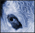
Moo-o Toneby JedusiComment by h2: Seeing the competition, it would have been a good idea to enter this, Steve. The title alone had gathered you some points :)
The blue tone is very well chosen, there's a lot of beautiful detail in the fur and lashes, lighting is not perfect but good enough. Border fits well, just bold enough to give the impression of looking through a window, the white line helps to separate the border from the background in top left. Subject is appealing, especially like how the calf (?) looks to the left and not forward, as if it was shy.
Composition could be enhanced; You used the rule-of-thirds, which doesn't work perfectly when the aspect ratio is square - I prefer centered or diagonal (bottom left to top right) compositions then. Try flipping the image and positioning the oval dark area on the diagonal.
Background at top left could be a little darker, while the dark area below his eye could show some more drawing. Dirt at bottom center is slightly distracting, might have been overlooked if it was not so close to the edge. A little catchlight in his eye would have been a nice addition.
Would have been a 7 from me (and you know I don't tend to be generous). |
| Photographer found comment helpful. |
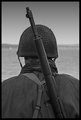
| 11/09/2007 05:59:41 PM |
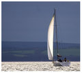
Evening Tideby JedusiComment by bergiekat: What a serenely beautiful photograph! Love the contrast of the boat in sunlight and the rest in shade...very dramatic. You've composed this will. Nicely done, mate! |
| Photographer found comment helpful. |
Home -
Challenges -
Community -
League -
Photos -
Cameras -
Lenses -
Learn -
Help -
Terms of Use -
Privacy -
Top ^
DPChallenge, and website content and design, Copyright © 2001-2026 Challenging Technologies, LLC.
All digital photo copyrights belong to the photographers and may not be used without permission.
Current Server Time: 06/16/2026 09:28:36 AM EDT.