Seeing the competition, it would have been a good idea to enter this, Steve. The title alone had gathered you some points :)
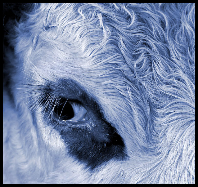
The blue tone is very well chosen, there's a lot of beautiful detail in the fur and lashes, lighting is not perfect but good enough. Border fits well, just bold enough to give the impression of looking through a window, the white line helps to separate the border from the background in top left. Subject is appealing, especially like how the calf (?) looks to the left and not forward, as if it was shy.
Composition could be enhanced; You used the rule-of-thirds, which doesn't work perfectly when the aspect ratio is square - I prefer centered or diagonal (bottom left to top right) compositions then. Try flipping the image and positioning the oval dark area on the diagonal.
Background at top left could be a little darker, while the dark area below his eye could show some more drawing. Dirt at bottom center is slightly distracting, might have been overlooked if it was not so close to the edge. A little catchlight in his eye would have been a nice addition.
Would have been a 7 from me (and you know I don't tend to be generous). |