| Image |
Comment |
| 11/27/2006 06:39:03 PM |
|
 Photographer found comment helpful. Photographer found comment helpful. |
| 11/27/2006 04:11:35 PM |
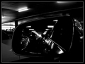
Park-itby GregoryBComment by kano: great shot, good use of the lights in the image
back to bump up |
| Photographer found comment helpful. |
| 11/26/2006 11:30:09 AM |
|
| Photographer found comment helpful. |
| 11/25/2006 04:52:42 PM |
|
| Photographer found comment helpful. |
| 11/24/2006 09:27:07 AM |
Park-itby GregoryBComment by Grandad: I would prefer colour on this, it's a bit on the dark side, and I don't think the border helps, haveing sead that, bay be you wanted it a bit dark, inside a car park, it's a good frame, and I like tha way the lights run into the distance, in the mirror, great idea. |
| Photographer found comment helpful. |
| 11/22/2006 03:52:03 PM |
|
| Photographer found comment helpful. |
| 11/22/2006 02:07:00 PM |
|
| Photographer found comment helpful. |
| 11/22/2006 04:54:51 AM |
Park-itby GregoryBComment by oijulia: Too dark... Would've been an interesting picture if I could see more of what's in the mirror... |
| Photographer found comment helpful. |
| 11/20/2006 08:33:42 AM |
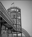
Doyles at the Quayby GregoryBComment by GrayGhost: I think that this image is underrated - it was one of my top picks for the challenge. I love the combination of straight and curved lines, lacey lattice work, flag flying. I agree with the previous comment that a little work on the shadows and hightlights would help and be more effective. Message edited by author 2006-11-20 08:34:10. |
| Photographer found comment helpful. |
| 11/14/2006 07:32:08 AM |
Doyles at the Quayby GregoryBComment by Ivory: Nice interesting compostion, I really like the use of space and lines, the way you have filled part of the frame with the building and left the space on the right is very nice. The contrast between the sky and the building is also very appealing. For me what I would have like to have seen would have been more highlights and shadow in the building itself, more pure whites to make the picture pop and more shadows to make the different shapes more defined and interesting. Overall I really like the picture just think it could have been more dramatic with more work on highlights and shadows. |
| Photographer found comment helpful. |
Home -
Challenges -
Community -
League -
Photos -
Cameras -
Lenses -
Learn -
Help -
Terms of Use -
Privacy -
Top ^
DPChallenge, and website content and design, Copyright © 2001-2026 Challenging Technologies, LLC.
All digital photo copyrights belong to the photographers and may not be used without permission.
Current Server Time: 07/16/2026 03:22:11 AM EDT.