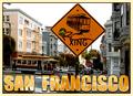
Cable Car Xingby
GotchyaComment by ursula: From the Critique Club
Hello,
On first impression, this is a striking postcard. The text jumps out at you, as does the street-sign with graffiti. It was a daring move on your part to use this photo for the postcard challenge!
Graffiti first: On the one hand, including it makes San Francisco more real, perhaps even more "likeable", more like a place where the common person would feel comfortable. On the other hand, I think it's highly unusual to include a sign with graffiti in a postcard - and this cost you in the challenge. For myself, I'm not sure; I like it, then again, if I were a tourist in San Francisco I would think, "Well, that's a shot I can take myself, why do I need to buy it in a postcard?"
The grey sky is also daring - most postcards seem to aim for the perfect blue. You didn't. I must say, the grey goes beautifully with the buildings on this street, and gives the flavour of the city better than if it were blue. I like the light - the street is for the most part in shadow, but still bright. Nice.
Focus also is good, actually, there's hardly anything out of focus in this picture, just the trees and buildings in the way back.
The text is beautiful, bold, appropriate. And the lighter border (of the card, not the text) softens it just so.
My nitpick: the streetlight in the top right hand corner, I think I would have tried to keep it out of the photo.
Good work! Take care,
Ursula (uabresch)