| Image |
Comment |
| 04/12/2010 07:07:40 PM |
waiting for the picture to doneby whiterookComment by Abra: Looking at their faces I can see that they are indeed looking forward for the photo to be taken to get on with what they really want to do so in my opion this meets the challenge.
However, I would like to offer some suggestions to how I believe the photo could have been improved - at least if I was the one taking it. A less distracting background would be nice but you can't always choose the background when getting the shot. I would try and avoid having the subject centered and would have cropped out the right hand side to remove the distracting red object at the bottom corner. The colours and skin tones appears over saturated for my tastes. Good luck with your entry. |
 Photographer found comment helpful. Photographer found comment helpful. |
| 04/12/2010 10:02:45 AM |
Look out areaby whiterookComment by mrbig65: humm,,,,,, what can i say ?? "nice t-shirt",,,,,,, |
| Photographer found comment helpful. |
| 04/12/2010 03:49:26 AM |
|
| Photographer found comment helpful. |
| 04/11/2010 11:13:40 AM |
|
| 04/10/2010 11:59:21 PM |
|
| 04/09/2010 07:34:48 PM |
|
| 04/09/2010 12:29:20 AM |
|
| Photographer found comment helpful. |
| 04/08/2010 10:43:13 PM |
|
| Photographer found comment helpful. |
| 04/08/2010 10:12:50 PM |
|
| 04/08/2010 09:29:54 PM |
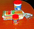
Peanut Butter and Fluff Sandwichby whiterookComment by Love6: hmmm if this were mine i'd probably hope someone would comment- so I shall :-) - perhaps a solid colored background would have been a wiser choice? instead of a brown table that looks like it has lights over head reflecting on it- and is nearly the same color as the peanutbutter... the flash used left harsh shadows- a diffuser or something to that effect might have helped (tissue over the flash to mute it down a bit and give it more of a feathered feel sometimes works) perhaps arranging the display of the items more creativly to captivate your viewer? (ie: take a single slice of bread, do a swirly design of peanutbutter and jelly together on it and set it on a simple black or white background...? just suggestions thoughts-- I really hope that my comment helps - goodluck
other things to note - the saturation was punched a bit high for this entry- it looks like you dodged and burned some element out of the upper corner so its a tad distracting... perhaps even just a long exposure with one directional light would have helped? sepia/black and white / |
| Photographer found comment helpful. |
Home -
Challenges -
Community -
League -
Photos -
Cameras -
Lenses -
Learn -
Help -
Terms of Use -
Privacy -
Top ^
DPChallenge, and website content and design, Copyright © 2001-2026 Challenging Technologies, LLC.
All digital photo copyrights belong to the photographers and may not be used without permission.
Current Server Time: 06/25/2026 02:52:13 AM EDT.