| Image |
Comment |
| 11/01/2005 12:15:31 AM |
|
 Photographer found comment helpful. Photographer found comment helpful. |
| 10/30/2005 09:30:06 PM |
Jordan Fall Portraitby ShannonComment by Prism: Again with this one, I love the composition and clarity of the shot but find the borders distracting. Perhaps if they weren't cutting so deeply into the picture on the sides... |
| 10/30/2005 09:26:36 PM |
Jordan with Scarecrowby ShannonComment by Prism: I like the composition of the shot with the positioning of your son and the scarecrow. I find the buttonizing borders to be distracting though and think overall, it would be better without the added effect, IMO. |
| Photographer found comment helpful. |
| 10/30/2005 01:42:10 PM |
Jordan Fall Portraitby ShannonComment by Jutilda: Darling baby. I think the Sponge Bob shirt is very distracting. I'd dress him in a solid color so we can concentrate on the face, as the pumpkins add enough busy sense to the shot. A dark blue shirt would be great, as it would enhance his eyes further and make a perfect contrast to the orange tones. |
| Photographer found comment helpful. |
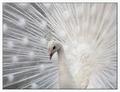
| 10/22/2005 08:43:50 PM |
Albino Peacockby ShannonComment by mrsasta: I've only actually been lucky to see an albino peacock once, this brought back great memories of that time. Thanks for posting a beautiful image. |
| Photographer found comment helpful. |
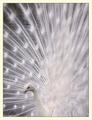
| 08/02/2005 03:35:33 PM |
Albino Peacock 3by ShannonComment by RHoldenSr: Shannon very nice work and great composition. Try framing it with a very thin white border then black or vice versa. The yellowish color border is not doing this shot justice! When you select the white to use select one of the softer tones from within the image. |
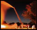
| 07/27/2005 01:27:38 AM |
DC Fire 2by ShannonComment by CLarson557: The longer exposure makes the water cool, but gave you some overexposed areas that aren't very appealing. Also gave you a lot of noise. Not a big fan of this one. |
| Photographer found comment helpful. |
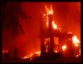
| 07/27/2005 01:25:09 AM |
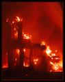
DC Fire 1by ShannonComment by CLarson557: Very nice picture. I like the orange glow from the fire. The flames are bright but not overexposed. The tree coming down at the left top corner adds a nice touch as well as the firemen. This one is my favorite of the ones you submitted. Very good job. i would score you a 10 :-) |
| Photographer found comment helpful. |
| 07/27/2005 01:13:04 AM |
DC Fire 1by ShannonComment by SJCarter: Very nice composition again. I like the red glow and the border is okay in this one. I would straighten the horizontal just a hair, but otherwise, I like it - good job. |
| Photographer found comment helpful. |
| 07/27/2005 01:12:06 AM |
DC Fire 3by ShannonComment by SJCarter: Again, I would ditch the border on this one. The one thing that bothers me most is the fact that the horizon isn't horizontal. Nice colors and detail. Cropped too tight in my opinion - I like the larger view shot much better. |
| Photographer found comment helpful. |
Home -
Challenges -
Community -
League -
Photos -
Cameras -
Lenses -
Learn -
Help -
Terms of Use -
Privacy -
Top ^
DPChallenge, and website content and design, Copyright © 2001-2026 Challenging Technologies, LLC.
All digital photo copyrights belong to the photographers and may not be used without permission.
Current Server Time: 07/27/2026 01:47:31 AM EDT.