| Image |
Comment |
| 11/05/2014 03:16:03 PM |
|
 Photographer found comment helpful. Photographer found comment helpful. |
| 11/05/2014 12:17:07 PM |
|
| Photographer found comment helpful. |
| 11/05/2014 09:11:19 AM |
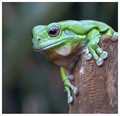
Alertby robstComment by armando_m: Wonderful forg, so green !
excellent focus on the eye
great processing achieving excellent IQ |
| Photographer found comment helpful. |
| 11/04/2014 11:53:21 AM |
|
| Photographer found comment helpful. |
| 11/04/2014 12:26:55 AM |
|
| 11/03/2014 10:21:37 AM |
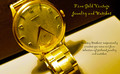
1960 18 Karat Gold Longinesby robstComment by MadMan2k: I think having it resting on something else could have looked better, also some softer light to prevent the blown highlights would have been nice. Not crazy about the loopy font for the lettering either. |
| 11/02/2014 08:51:39 AM |
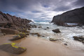
Fleurieu Coastby robstComment by sacredspirit: The colors are just wonderful, and the blue way back on the ocean drive me into a place of graceful wonder, and of course envy. LOL. I want a romantic dream within this photo, and it makes me crazy being in the mid-west, and not being able to part of this work of god. Beautiful job, and great execution. |
| Photographer found comment helpful. |
| 11/01/2014 09:57:03 PM |
1960 18 Karat Gold Longinesby robstComment by Lydia: I don't like your font... it needs to be able to be quickly read as I pass by your billboard or flip through my magazine to get to another article. It needs to grab me, not make me struggle to read it.
Also, the bright yellows in the watch band and the blown spots compete for my attention (and win) against the face of the watch.
I do like your composition, although I would not have cropped it so close on the upper edge of the face of the watch.
I wish the face of the watch were the brightest spot in the whole image... so my attention would go there immediately and want to stay there... and buy your jewelry. :D
I love the angle of the watch at a tilt to make the advertisement not so rigid. Good choice. 6 |
| 10/31/2014 05:10:57 PM |
|
| 10/31/2014 11:58:30 AM |
1960 18 Karat Gold Longinesby robstComment by Elaine: My observations: Did you mean "respectfully" instead of "respectively"? There is too much yellow for me. I know it's a gold watch, but the color seems off. Lighting is a bit harsh, creating blown out spots and distracting shadows. |
Home -
Challenges -
Community -
League -
Photos -
Cameras -
Lenses -
Learn -
Help -
Terms of Use -
Privacy -
Top ^
DPChallenge, and website content and design, Copyright © 2001-2026 Challenging Technologies, LLC.
All digital photo copyrights belong to the photographers and may not be used without permission.
Current Server Time: 06/21/2026 01:32:04 PM EDT.