| Image |
Comment |
| 05/04/2007 09:55:34 AM |
|
 Photographer found comment helpful. Photographer found comment helpful. |
| 05/04/2007 09:48:09 AM |
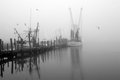
Brigadoon Harborby noranekoComment by muckpond: this is really beautiful -- a natural gradient! i would bump up the contrastiness™ more. it seems overall pretty gray -- but i am looking at it on an uncalibrated monitor. :) |
| Photographer found comment helpful. |
| 05/04/2007 09:21:07 AM |
|
| Photographer found comment helpful. |
| 05/04/2007 09:10:48 AM |
|
| Photographer found comment helpful. |
| 05/04/2007 08:59:52 AM |
|
| Photographer found comment helpful. |
| 05/04/2007 08:51:53 AM |
Brigadoon Harborby noranekoComment by violinist123: Wow you've just raised the bar on your 30 day shots - how will you beat this??? Very nice photo, great bw treatment. Nice composition, and foggy pier shots are always good to look at imo. Well done! |
| Photographer found comment helpful. |
| 05/04/2007 08:43:25 AM |
Brigadoon Harborby noranekoComment by bassbone: This is really very good - the bird flying to 'nowhere' is the best part of the image - adds the necessary tension and focal point to bring 'just another pier shot' into something much more. |
| Photographer found comment helpful. |
| 05/04/2007 08:40:16 AM |
|
| Photographer found comment helpful. |
| 05/04/2007 08:36:52 AM |
Brigadoon Harborby noranekoComment by Melethia: I don't know that you can up the contrast anymore without losing a lot of detail or creating artifacts. When you shoot fog, you get soft light, which is the joy of fog to begin with. That said, I'd love to see up to the first bird on the left a bit less fogged, but not sure if that's possible. I love how it fades to no discernible horizon, too. |
| Photographer found comment helpful. |
| 05/04/2007 08:13:28 AM |
Brigadoon Harborby noranekoComment by roz: talk about stunning, beautiful, atmospheric and just plain wonderful ... a totally gorgeous image .. the birds make this just perfect ... |
| Photographer found comment helpful. |
Home -
Challenges -
Community -
League -
Photos -
Cameras -
Lenses -
Learn -
Help -
Terms of Use -
Privacy -
Top ^
DPChallenge, and website content and design, Copyright © 2001-2026 Challenging Technologies, LLC.
All digital photo copyrights belong to the photographers and may not be used without permission.
Current Server Time: 06/21/2026 01:34:50 PM EDT.