| Image |
Comment |
| 05/09/2007 08:12:09 PM |
Desolationby noranekoComment by JunieMoon: I love this shot. I wish I could have such a find. Love the sand tone texture. This is just beautiful. |
 Photographer found comment helpful. Photographer found comment helpful. |
| 05/09/2007 07:04:47 PM |
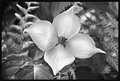
Dogwoodby noranekoComment by colorcarnival: love this - it just reaches out and begs for your attention. love how the lighting enhances the detail on the petals. does this have what people call a bokeh background? very pretty! |
| Photographer found comment helpful. |
| 05/09/2007 06:49:47 PM |
|
| Photographer found comment helpful. |
| 05/09/2007 05:50:55 PM |
|
| Photographer found comment helpful. |
| 05/09/2007 05:46:23 PM |
Beyondby noranekoComment by jonfrommk: Oh my word. Your images in this challenge just seem to be getting better and better. I love this shot. the dof is perfect and the contrast between the sand , the plant and the (beautiful) sky is outstanding
Without question my favourite of your entries to date.
Even in B&W you can feel warmth radiating from this shot
Just wonderful |
| Photographer found comment helpful. |
| 05/09/2007 05:44:10 PM |
Many Minisby noranekoComment by Venom: Yeah, Minis ROCK!! This is an awesome photo; great shooting.
I just bought an '06 MINI Cooper at the beginning of this year. They are so much fun to drive :-) |
| Photographer found comment helpful. |
| 05/09/2007 05:23:24 PM |
Desolationby noranekoComment by Jutilda: OH WOW. This one - I even like it better. Great composition and tone. What a beauty. |
| Photographer found comment helpful. |
| 05/09/2007 04:26:48 PM |
|
| Photographer found comment helpful. |
| 05/09/2007 03:59:10 PM |
Beyondby noranekoComment by undieyatch: Dramatic landscape tone, w/brush & sage expanding to double horizon to dark sky & whispy clouds. |
| Photographer found comment helpful. |
| 05/09/2007 03:23:47 PM |
|
| Photographer found comment helpful. |
Home -
Challenges -
Community -
League -
Photos -
Cameras -
Lenses -
Learn -
Help -
Terms of Use -
Privacy -
Top ^
DPChallenge, and website content and design, Copyright © 2001-2026 Challenging Technologies, LLC.
All digital photo copyrights belong to the photographers and may not be used without permission.
Current Server Time: 06/21/2026 07:49:01 PM EDT.