| Image |
Comment |
| 06/24/2009 01:42:02 PM |
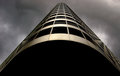
Menacingby CitadelComment by SandyP: This is really good! In a challenge like this where architecture might be the first thing people think of, it takes alot for a photo to really stand out. Mission accomplished!!! This is so clean, and so striking. It looks like it reaches past the heavens! |
 Photographer found comment helpful. Photographer found comment helpful. |
| 06/24/2009 10:10:25 AM |
|
| Photographer found comment helpful. |
| 06/24/2009 08:20:18 AM |
|
| Photographer found comment helpful. |
| 06/22/2009 06:53:18 PM |
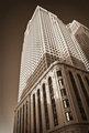
Bankers Hall - Eastby CitadelComment by snaffles: Greetings from the Critique Club!
Initial impression: the style of the building, sepia and pov combine to make it look like an opening shot for a Dick Tracy movie. Very atmospheric. Had I voted, an 8.
Technical: You used ambient light and the few shadows you did get just enchance the shot and scale of the building. Composition might be called stark by some, but I find it achingly simple.
Artistic: Good for you, having the discipline to get downtown and get this shot at 6 a.m. with the golden light! Seeing how high you scored it seems to have paid off. I am very fond of this extreme pov, so bonus points for that :-)
Overall: Not familiar with Lightroom, but whatever you did clearly works, and all the pp in the world will not save a poor shot. Again, a lovely image, I am a bit disappointed by the lack of comments, but perhaps voters were Architecture'd out.
Feel free to pm me with any questions,
Susan |
| Photographer found comment helpful. |
| 06/20/2009 12:27:39 PM |
Orangeby CitadelComment by kivgaen: Good clear focus on the car. It's not a bad photograph and technically I can't find fault with it, but the composition is a bit boring. |
| Photographer found comment helpful. |
| 06/17/2009 09:18:25 PM |
|
| Photographer found comment helpful. |
| 06/17/2009 12:25:22 PM |
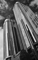
Western Canadian Placeby CitadelComment by Mark-A: Greetings from the Critique Club :)
I really like this image I think the subject is spot on with regards meeting the challenge as the 6+ final score shows.
You have captured this building in a very clever way, the left hand edge being straight within the frame and the leaning of the right hand side I find very nice compositionally which makes for a nice lead down through the image where my eyes come to rest on the dark area (what I assume is the entrance of the building) unfortunately I feel this may be where the image falls down ever so slightly and what may have stopped it from scoring even higher, the dark area is maybe a little too dark especially after all the glorious detail within the upper 2/3 of the shot. Obviously this is out of your control in a basic editing challenge so I understand you were working within the limitations of the shot recorded.
Conversion to B&W fits this image extremely well and the sky is nice and dramatic, I wonder if anyone was fooled into thinking this was over sharpened looking at the windows on the left hand building, however I do not think it is oversharpened I believe it to be the reflections of the building opposite making for a busier area. My opinion is your post work was right on the money.
Overall a very fine entry which easily deserved your 6+ score
Mark |
| Photographer found comment helpful. |
| 06/13/2009 12:15:37 PM |
|
| Photographer found comment helpful. |
| 06/13/2009 11:43:53 AM |
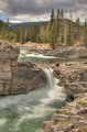
Elbow Fallsby CitadelComment by salmiakki: Greetings from the Critique Club
This is one of those images that has so much potential but really falls short due to the processing. The composition is excellent.
I think unless you are using a tripod, you are always going to be better off using one image and exposing it 3 different ways in photoshop prior to importing into HDR software. This would have stopped the ghosting which is present.
I often find after tonemapping an image needs to have a few adjustments made in PS. I think in this case a boost in contrast and saturation would have gone a long way, but even those would not have compensated for the ghosting in the original HDR merging.
Try it again using only one of the images. I expect it will look a lot different. Still a beautiful location and fantastic scenery. |
| Photographer found comment helpful. |
| 06/12/2009 01:05:03 AM |
|
| Photographer found comment helpful. |
Home -
Challenges -
Community -
League -
Photos -
Cameras -
Lenses -
Learn -
Help -
Terms of Use -
Privacy -
Top ^
DPChallenge, and website content and design, Copyright © 2001-2026 Challenging Technologies, LLC.
All digital photo copyrights belong to the photographers and may not be used without permission.
Current Server Time: 06/23/2026 08:19:30 PM EDT.