| Image |
Comment |
| 12/26/2007 10:22:26 AM |
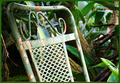
Outcastby JuliBocComment by colorcarnival: I love how the greens and spots of orange also match the background. I think I would have liked to have seen either more of the chair in focus or the part in the foreground. However I don't think the background is a distraction, it works well with the whole theme of the pic. |
 Photographer found comment helpful. Photographer found comment helpful. |
| 12/26/2007 08:11:30 AM |
Outcastby JuliBocComment by bmartuch: I like the old worn weathered look this has and how it seems to fit the background so well. |
| Photographer found comment helpful. |
| 12/26/2007 03:19:57 AM |
Outcastby JuliBocComment by Melethia: I like how the chair is becoming part of its environment - blends right in and feels right at home there. It may be outcast from other, newer chairs, but it belongs with the rest of the scene quite well. |
| Photographer found comment helpful. |
| 12/25/2007 09:24:47 AM |
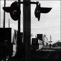
RR Xingby JuliBocComment by andrewt: Image just a little messy with cable lines and the shadow created by the lighting. Recommend to clone away the lines - 5 |
| Photographer found comment helpful. |
| 12/24/2007 05:28:07 PM |
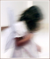
Too Soonby JuliBocComment by posthumous: I prefer this version. Excellent use of blur. It never disturbed my eyes at all, and would have been a top scorer for me. |
| Photographer found comment helpful. |
| 12/24/2007 11:56:48 AM |
Outcastby JuliBocComment by Yo_Spiff: Simple, but it works. Great colors. My only quibbles are the shadow at the top left and the minor loss of DOF at the left side of the chair. This shows a good eye. An interesting shot of an everyday item. Fits both "everyday" and "Wabi-Sabi". |
| Photographer found comment helpful. |
| 12/24/2007 09:32:30 AM |
|
| Photographer found comment helpful. |
| 12/24/2007 05:39:33 AM |
|
| Photographer found comment helpful. |
| 12/22/2007 11:50:52 PM |
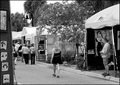
For Saleby JuliBocComment by levyj413: I voted this a 5, Julianne. Here's why. First, I thought this looked like a pretty empty scene, actually not a crowded one. Second, her dead-center location kept drawing my attention away from all the interesting details in the rest of the frame. So the composition bothered me. Aside from the challenge theme, I think the contrast between her and others would've been stronger without the multiple themes: either the right side to contrast her and the guy or the left to contrast her and the other people. Finally, you've been here long enough to know how true it is that voters, on average, prefer the obvious. |
| Photographer found comment helpful. |
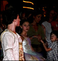
| 12/22/2007 11:26:52 PM |
All Eyes on Prince Charmingby JuliBocComment by levyj413: Julianne, you're a good enough photographer to know the technical problems. I understand your thoughts on the central figure, but to me it's clearly Prince Charming, not the kid on the right. After him, at least to me, it's the girl to his right. Maybe the interaction between them is the main story. Whatever - as usual, if you like it, then be happy with it. :) |
| Photographer found comment helpful. |
Home -
Challenges -
Community -
League -
Photos -
Cameras -
Lenses -
Learn -
Help -
Terms of Use -
Privacy -
Top ^
DPChallenge, and website content and design, Copyright © 2001-2026 Challenging Technologies, LLC.
All digital photo copyrights belong to the photographers and may not be used without permission.
Current Server Time: 05/06/2026 01:03:32 PM EDT.