| Image |
Comment |
| 05/21/2003 10:20:52 AM |
|
 Photographer found comment helpful. Photographer found comment helpful. |
| 05/21/2003 12:29:00 AM |
|
| Photographer found comment helpful. |
| 05/20/2003 03:49:24 PM |
Where the dressing?by ladpupmoeComment by eloise: Decent colors, but this picture isn't about anything in particular. Its composition feels accidental, haphazard, jumbled. The focus choices draw my eye to the ripples in the lettuce leaves, but then there's nothing really to look at it in it. |
| Photographer found comment helpful. |
| 05/20/2003 01:39:53 PM |
|
| Photographer found comment helpful. |
| 05/20/2003 06:11:37 AM |
|
| Photographer found comment helpful. |
| 05/19/2003 07:13:32 PM |
Red Maple ~ Green Mapleby ladpupmoeComment by Gordon: this meets the challenge, but the light is a bit dull. The seeds on the left also create a bright area that detracts from the red/green combination and draw the eye away. |
| Photographer found comment helpful. |
| 05/19/2003 03:09:51 PM |
|
| Photographer found comment helpful. |
| 05/19/2003 10:57:22 AM |
Red Maple ~ Green Mapleby ladpupmoeComment by emorgan49: too many distractions - try it on a more neutral background - do you need both kinds of seed pod? Either keep more in the frame or less, like this it just looks cut off. |
| Photographer found comment helpful. |
| 05/19/2003 09:50:27 AM |
|
| Photographer found comment helpful. |
| 05/18/2003 05:34:33 PM |
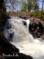
Boonton Fallsby ladpupmoeComment by karmat: CRITIQUE CLUB CRITIQUE
by karmat
I really like the dramatic lighting in this. It helps to showcase the rocks and the rushing water well. It seems to be a touch overexposed on the water, but just a touch.I also like the vivid colors of the green around as well. The composition is effective in that the falls start going to the left then curves gracefully back to the right. This helps to lead the eye through the picture.
The telephone pole bothers me for several reasons, however. Since it is tilted, it gives the illusion that the entire shot is tilted because we associate poles with being vertical. Also, it gives the shot the feeling that this is a small waterfall in the middle of town that is rushing because of recent rain, or something. The pole just makes me think of a more populated section. If you could have framed so that the pole was not there, or cropped it out, I think it would have been more effective.
I don't know what settings you used, or if they could have been controlled, but if you could have used a slow shutter speed, and gotten a "smooth" looking waterfall, that would have been almost poetic, I think.
If you have any questions or comments please feel free to PM me!
Best to you in future challenges.
karmat |
| Photographer found comment helpful. |
Home -
Challenges -
Community -
League -
Photos -
Cameras -
Lenses -
Learn -
Help -
Terms of Use -
Privacy -
Top ^
DPChallenge, and website content and design, Copyright © 2001-2026 Challenging Technologies, LLC.
All digital photo copyrights belong to the photographers and may not be used without permission.
Current Server Time: 06/16/2026 09:28:57 AM EDT.