| Image |
Comment |
| 07/20/2002 05:48:00 PM |
|
| 07/20/2002 02:01:00 PM |
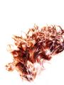
Flareby GordonComment by RedRuthann: Different and creative. Cool image. I like this a lot. Great work! Ruthann |
| 07/20/2002 09:23:00 AM |
Flareby GordonComment by Jonniboy: Love the negative space. Would have been a 10 if you hadn't clipped the rhs! |
| 07/20/2002 02:18:00 AM |
Flareby GordonComment by Nswenson0: AHH!!! THE 80'S ARE BACK!!! NO!!! Just kidding! the only real problem I notice is It's simply way too bright Keep up the good work: -7 |
| 07/20/2002 12:16:00 AM |
|
| 07/19/2002 03:58:00 PM |
Flareby GordonComment by Remie: Very impressive photo. The simplicity of colors and the composition is superb. I'm pretty sure you gonna get a lot of comments about the "hair-cut" at the right edge. Well, here's another one: I like it! I think the subject would look kind of lost in the white space if it wasn't for the cut-off. |
| 07/19/2002 03:08:00 PM |
Flareby GordonComment by chariot: This could have been a great pictures had there been more white space at the top and not so bright along the edges |
| 07/19/2002 06:25:00 AM |
Flareby GordonComment by UberFish: Not sure I like the framing, particularly the cropping on the right. |
| 07/19/2002 12:21:00 AM |
|
| 07/18/2002 10:44:00 PM |
|
Home -
Challenges -
Community -
League -
Photos -
Cameras -
Lenses -
Learn -
Help -
Terms of Use -
Privacy -
Top ^
DPChallenge, and website content and design, Copyright © 2001-2026 Challenging Technologies, LLC.
All digital photo copyrights belong to the photographers and may not be used without permission.
Current Server Time: 07/17/2026 03:37:23 PM EDT.