| Image |
Comment |
| 04/21/2003 11:28:59 AM |
|
| 04/17/2003 08:25:12 AM |
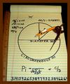
Computing Piby JeileenComment by kiwiness: Critique Club:
Hi Joy I get to critique you again :-) This was a very good idea for the pi challenge and it is exactly what I had in mind when I first saw the challenge subject. I bought myself a compass and started writing all kinds of formulas on paper and drawing circles etc., but nothing turned out the way I wanted it too.
Composition: Simple and effective. As you've already read in the comments below, the problem here is the border. It is a little too wide, and the color clashes with the rest of the photo, in my opinion this image would have been better without the border completely. The crop is a little too tight, I think cropping out the bottom of the paper pad wasn't necessary as the half cut "4" looks a little strange.
All in all: This is a simple photo which doesn't possess that "wow" effect. The colors are very good and complement each other (excluding the border), the lighting is optimal and everything is in focus.
Good luck in future challenges and happy Easter.
Gary |
| 04/13/2003 10:20:34 PM |
|
| 04/13/2003 09:19:29 PM |
|
 Photographer found comment helpful. Photographer found comment helpful. |
| 04/13/2003 08:19:57 PM |
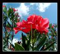
Pointed Colorby JeileenComment by GeneralE: Beautiful aubject, like the composition and focus. I'd recommend a very dark or black border here -- I think it will help the image "pop off the page" more effectively than the lighter one you've used here. |
| Photographer found comment helpful. |
| 04/12/2003 09:34:20 PM |
|
| 04/12/2003 02:29:05 PM |
Pointed Colorby JeileenComment by ruthiek: I like your picture a lot -- but for me, the color of the frame detracts from it a little bit. Actually, I'm not sure if it's the color of the frame or the frame itself, but I think the contrast of the yellow flower and bright blue sky would be much stronger without the frame. |
| Photographer found comment helpful. |
| 04/12/2003 11:55:13 AM |
Computing Piby JeileenComment by lisae: Not a very attractive photo. The combination of colours here alone is nasty. Black, yellow and brown!! The composition and lighting need a lot of work, and the border is too wide, without anything to separate it from the rest of the image (eg. a thin white border on the inside). |
| 04/12/2003 07:17:10 AM |
|
| Photographer found comment helpful. |
| 04/11/2003 10:37:50 PM |
|
| Photographer found comment helpful. |
Home -
Challenges -
Community -
League -
Photos -
Cameras -
Lenses -
Learn -
Help -
Terms of Use -
Privacy -
Top ^
DPChallenge, and website content and design, Copyright © 2001-2026 Challenging Technologies, LLC.
All digital photo copyrights belong to the photographers and may not be used without permission.
Current Server Time: 07/16/2026 07:55:17 AM EDT.