| Image |
Comment |
| 09/29/2005 07:16:10 PM |
|
 Photographer found comment helpful. Photographer found comment helpful. |
| 09/28/2005 06:22:28 PM |
|
| Photographer found comment helpful. |
| 09/28/2005 05:42:18 PM |
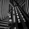
Hotelby theflyComment by swm4lfe_2001: Those are elevators right? I think it would have looked better if they were crisp, or really blurr. Having them only slightly blurred makes it look like an accident. But I do love all of the lines and patterns. It looks nice. |
| Photographer found comment helpful. |
| 09/28/2005 08:34:29 AM |
Hotelby theflyComment by Jutilda: Great graphic sense to it. I like the architecture. Black and white is the perfect choice although there is alot of gray tones and not as much pure black and white. |
| Photographer found comment helpful. |
| 09/28/2005 07:17:06 AM |
Hotelby theflyComment by bob_bobski: Are you sure this is a hotel and not a screen grab from "5th Element" or "Blade Runner" ;-) 7 |
| Photographer found comment helpful. |
| 09/18/2005 10:12:36 AM |
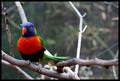
a good place to restby theflyComment by admart01: Greetings from the Critique Club and congrats on the high placement and score.
Obviously a solid image. I've read through the many comments you have already and will try not to repeat.
Suggestions: the midground is the weaker area (as the dof and bird are excellent) It's a bit cluttered with light colored branches and distracts my eye from the subject. The branch "growing" out the of the bird's head weakens the composition as well. I offer these observations not because you could necessarily control where the bird lands but more from a "here's what detracts" pov. Cropping out the right stick (from about the center and to the right edge) might simplify the compostion and remove some of the clutter -- just a thought.
Again, strong image and the suggestion is only one woman's opinion.
Please email me with any questions and Happy shooting :)
Theresa |
| Photographer found comment helpful. |
| 09/13/2005 11:29:26 PM |
|
| Photographer found comment helpful. |
| 09/13/2005 09:58:41 PM |
a good place to restby theflyComment by Bus352: Beautiful composition and color--(I have know what camera brand you've used). Though I tend not to like frames, it works very well with this--this is a 10 in my book |
| Photographer found comment helpful. |
| 09/13/2005 12:48:38 PM |
|
| Photographer found comment helpful. |
| 09/13/2005 10:53:13 AM |
|
| Photographer found comment helpful. |
Home -
Challenges -
Community -
League -
Photos -
Cameras -
Lenses -
Learn -
Help -
Terms of Use -
Privacy -
Top ^
DPChallenge, and website content and design, Copyright © 2001-2026 Challenging Technologies, LLC.
All digital photo copyrights belong to the photographers and may not be used without permission.
Current Server Time: 07/15/2026 01:27:54 PM EDT.