| Image |
Comment |
| 05/04/2007 08:00:51 AM |
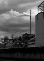
Bleakby RetroesqueComment by sherpet: I not to familar with the song, but thee image really stands out for me.
I like the contrast of grey to black various tones, balnced with some white to bring it all together. The smoke adds to the clouds in the sky, along with the industerial darkness in the foreground.....
I actully like this quite a lot..... |
 Photographer found comment helpful. Photographer found comment helpful. |
| 05/04/2007 07:59:57 AM |
Bleakby RetroesqueComment by jonfrommk: Nicely titled and an excellent image of urban blight. The smoke coming out of the chminey is great in terms of standing out against the clouds (It cant be good news when the smoke stack looks clearer than the sky)
I love the range of shots you are taking for this challenge
Possible thoughts for minor tweaks
Crop a fraction higher to lose the curb?
Crop slightly to the left to losr the lamppost (which just doesnt quite have enough omph in terms of it standing out)
Maybe(????) clone out the poster on the wall (but definitely leave the graffiti)
Jon |
| Photographer found comment helpful. |
| 05/04/2007 07:14:40 AM |
|
| Photographer found comment helpful. |
| 05/03/2007 10:02:26 PM |
Tina'sby RetroesqueComment by boysetsfire: i swear i commented and fav'd this already, what happened?
one of the standouts for me so far in the b&w's
nick |
| Photographer found comment helpful. |
| 05/03/2007 09:12:19 PM |
Tina'sby RetroesqueComment by Phil: Okay - this is damned good and has reached my favorites. This is one of those images that I can't give you one reason why it works for me but I can't stop looking at it. I love when that happens. Thank you. |
| Photographer found comment helpful. |
| 05/03/2007 07:52:49 PM |
|
| Photographer found comment helpful. |
| 05/03/2007 07:32:26 PM |
|
| Photographer found comment helpful. |
| 05/03/2007 06:08:37 PM |
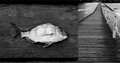
Fishby RetroesqueComment by menele: Good idea and detail in the shots is great. Feel they could match better than they do, as mentioned by others. |
| Photographer found comment helpful. |
| 05/03/2007 05:17:10 PM |
Tina'sby RetroesqueComment by ursula: This is a really neat picture! Love it. It definitely is a slice of life. I like it just the way it is. |
| Photographer found comment helpful. |
| 05/03/2007 02:14:59 PM |
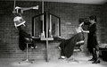
Tina'sby RetroesqueComment by violinist123: Interesting. There's about 5 photos worth of material contained in this one shot lol.
I like the processing and the scene was well suited for it. However there's so much going on, it's hard to get myself hooked into any particular thing presented here. I'd agree with some comments below about trying alternative crops to try and give the eye a more limited menu of things to dine on. To me, the most unique thing shown here is a woman doing hair in some pretty radical looking boots and her client sitting there in gym shoes. Don't know why, but the contrast there jumps out at me right away and I'd like a photo that just shows me those two without everything else around them.
But hey, opinions are like... |
| Photographer found comment helpful. |
Home -
Challenges -
Community -
League -
Photos -
Cameras -
Lenses -
Learn -
Help -
Terms of Use -
Privacy -
Top ^
DPChallenge, and website content and design, Copyright © 2001-2026 Challenging Technologies, LLC.
All digital photo copyrights belong to the photographers and may not be used without permission.
Current Server Time: 07/21/2026 04:16:38 PM EDT.