| Image |
Comment |
| 04/04/2003 02:56:19 PM |
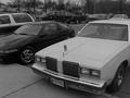
Old and Newby AllenComment by timj351: Critique Club Critique by Tim Jensen
The idea behind this photo is a pretty good one. I love cars and I think since there are so many variations the idea of contrasting an old car with a new one to represent time is pretty good. However, the main problem I have with this photo is that the theme is not very clear by looking at the photo itself. I'm also very unclear as to what the can has to do with the photo unless that is really part of your theme. I just can't completely figure it all out. You would need to figure out a more effective way to convey your idea. A tighter cropping to eliminate unwanted background elements and a more interesting composition and perspective could help improve on this.
I would also have preferred color in this photo unless the above suggestions were used and there was more contrast. As it is there just doesn't seem to be a strong reason to use B&W. Color would help it pop out more and command more attention.
The execution is fairly good with some slight softness to the edges. It's pretty clean but needs more contrast as a B&W.
Overall I have to say this is a pretty ordinary photo but with plenty of potential. It needs much more creativity especially in regards to the composition and perspective. this way you can better grab the viewer's attention.
T |
| 04/03/2003 07:44:06 PM |
|
| 03/31/2003 08:49:35 PM |
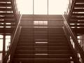
stairs of symmetryby AllenComment by Lustre: This photo has a real aged quality to it - I hope that's the effect you were seeking. I like the symmetry and composition, and I actualy like the aged effect. |
| 03/31/2003 05:05:37 PM |
|
| 03/31/2003 05:00:06 PM |
|
| 03/31/2003 02:29:38 PM |
stairs of symmetryby AllenComment by Compaq: not very symetrical, could've used something symetical, i fink dat u coulda useded less of that their lighting and more of that ther shadows. |
| 03/31/2003 11:46:02 AM |
|
| 03/31/2003 10:27:17 AM |
|
| 03/30/2003 02:32:00 PM |
Old and Newby AllenComment by Maverick: I think the idea is stretched a bit here. I think the image would be more effective if you could have found an older car (50's era or older) and compared it with a newer car (the cars there are neither very old or very new...) I think the image is also cropped too tight on the left. Nice idea, but I think it could be improved. |
| 03/30/2003 01:09:30 PM |
|
Home -
Challenges -
Community -
League -
Photos -
Cameras -
Lenses -
Learn -
Help -
Terms of Use -
Privacy -
Top ^
DPChallenge, and website content and design, Copyright © 2001-2026 Challenging Technologies, LLC.
All digital photo copyrights belong to the photographers and may not be used without permission.
Current Server Time: 07/16/2026 07:31:19 AM EDT.