| Image |
Comment |
| 11/20/2007 03:14:30 PM |
|
 Photographer found comment helpful. Photographer found comment helpful. |
| 11/20/2007 03:14:00 PM |
|
| 11/20/2007 03:13:40 PM |
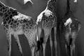
...Even shunned by the animalsby CKYidiotComment by CalamitysMaster00: Interesting perspective, you cut their feet and their head so no one can get upset about the cropping, the rule of thirds works well here as there is no real subject and its well balanced and great use of b/w |
| Photographer found comment helpful. |
| 11/20/2007 03:12:37 PM |
|
| Photographer found comment helpful. |
| 11/20/2007 03:00:00 PM |
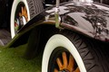
And the rockets' red glare...by CKYidiotComment by aliqui: I have to admit, this photo was the first to jump off the screen. Like everyone else I said "ooo pretty pink." (I hate pink, mind you)
1) I cropped out the blacker bit of sky in your top left corner. To me this image is about the pink water. Sure, the firework is pretty, but we've all seen fireworks, and they themselves don't have a "wow" factor. With that in mind, it doesn't hurt to chop a little bit of it out.
2) I used the Sharpen Tool on your foreground boat.
3) I Dodged Highlights and Burned Shadows. I find that this helps sharpen images without actually using any of the sharpening tools. It also helps with fog/haze. I used it to bring out your city a bit. I also used it on the main boat to clear it up.
4) If I could I would move your foremost boat, but I can't, heh. Composition wise, it needs to be at least 1/2 inch to the left.
My Edit
 |
| Photographer found comment helpful. |
| 11/19/2007 10:39:23 AM |
Purity of Youthby CKYidiotComment by Yo_Spiff: I think the wire that goes across the middle of the shot behind the fountain is distracting. You could clone it out fairly easily.
The rest of the image seems a little pixelated. My same comment regarding he space needle applies. Play with resampling methods to get something smoother looking. |
| Photographer found comment helpful. |
| 11/19/2007 09:32:05 AM |
And the rockets' red glare...by CKYidiotComment by Yo_Spiff: A lot of impact here. To be nitpicky (per your request) the overhead burst and that nicely lit cityscape seem to be fighting for my attention. Perhaps a different crop would clear up what the subject is and lead the eye better. |
| Photographer found comment helpful. |
| 11/19/2007 09:28:31 AM |
Breakfast in bedby CKYidiotComment by Yo_Spiff: Some serious posterization going on here. The composition doe snot seem to work for me either. None of the multiple subjects really stand out to me. |
| Photographer found comment helpful. |
| 11/19/2007 09:25:44 AM |
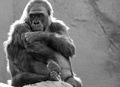
His Own Thoughtsby CKYidiotComment by Yo_Spiff: I like this shot. Since he is backlit, a little enhancement in the shadow areas and sharpening of the detail on his fur might give it some more impact. I love to see texture. |
| Photographer found comment helpful. |
| 11/06/2007 03:32:05 PM |
His Own Thoughtsby CKYidiotComment by McFrikki: Good capture.... reminds my of myself. =) I like the lighting, but I think a bit more contrast could be nice, also could try cropping it into a portrait to get more of a human portrait feel to it. ;) |
| Photographer found comment helpful. |
Home -
Challenges -
Community -
League -
Photos -
Cameras -
Lenses -
Learn -
Help -
Terms of Use -
Privacy -
Top ^
DPChallenge, and website content and design, Copyright © 2001-2026 Challenging Technologies, LLC.
All digital photo copyrights belong to the photographers and may not be used without permission.
Current Server Time: 07/15/2026 12:00:35 PM EDT.