| Image |
Comment |
| 03/24/2004 03:50:35 AM |
|
 Photographer found comment helpful. Photographer found comment helpful. |
| 03/23/2004 04:52:41 PM |
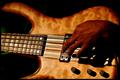
Playing on linesby pitsamanComment by Mark: It's a nice photo, but the hand seems to be at an alkward angle, which slightly detracts from the photo. Also the green stripe on the left side is distracting. Nice photo |
| Photographer found comment helpful. |
| 03/23/2004 02:56:36 PM |
|
| Photographer found comment helpful. |
| 03/23/2004 11:45:02 AM |
|
| Photographer found comment helpful. |
| 03/23/2004 08:24:11 AM |
|
| Photographer found comment helpful. |
| 03/23/2004 05:08:11 AM |
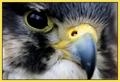
Bird Timesby pitsamanComment by cbonsall: (I'm writing this to everyone who submitted a landscape shot) The challenge was to produce a shot worthy of a magazine cover but to me a shot like this is not suitable to be put on a "portrait" format magazine.
Great pic otherwise though I do find the border distracting
---ADDITIONAL---
Due to forum discussions and accusations that marking landscapes down is nitpicking, I'm going through them and remarking. I still think some of the landscapes would not make good covers because of their orientation but I am no longer marking down because of that.
I still think landscape is inapropriate for the majority of magazines but I'll give the benefit of the doubt to the photographers. |
| Photographer found comment helpful. |
| 03/23/2004 03:18:44 AM |
Bird Timesby pitsamanComment by nordic: Very distinctive photo, I like it a lot, although I think a portrait photo for this challenge is better - 8 |
| Photographer found comment helpful. |
| 03/23/2004 12:09:16 AM |
Bird Timesby pitsamanComment by ChrisW123: Magazine covers should be Portrait not Landscape. It amazes me how many people don't seem to realize this or think of it. With the apparent high rez you have here, it seems you could have easily cropped this so that it's Portrait. |
| Photographer found comment helpful. |
| 03/22/2004 11:41:14 PM |
|
| Photographer found comment helpful. |
| 03/22/2004 03:45:13 PM |
Bird Timesby pitsamanComment by terje: excellent idea, but its not magazine format. maybe better with the nose in focus as well. But colorwise its very good. |
| Photographer found comment helpful. |
Home -
Challenges -
Community -
League -
Photos -
Cameras -
Lenses -
Learn -
Help -
Terms of Use -
Privacy -
Top ^
DPChallenge, and website content and design, Copyright © 2001-2026 Challenging Technologies, LLC.
All digital photo copyrights belong to the photographers and may not be used without permission.
Current Server Time: 07/27/2026 06:03:03 PM EDT.