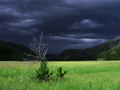
A dark cloud eyeing a dry treeby
snowleopard10101Comment by Artyste: Greetings from the Critique Club. My critiques are generally geared towards trying to help you improve your score within DPC, and not on any true "artistic" merit of the photograph itself, unless it relates to DPC voters and scoring. Please keep that in mind as you read this.
Initial Thoughts
Some good, dark energy here, but beyond the background, I'm left wanting.
Composition/Content
A good use of an off-centered subject, giving us some open area, and allowing us to find the tree, follow it upwards, and lose ourselves in the ominous background clouds. One of the points that I find detracts, however, *is* the ominous background. It grabs all of my attention, leaving nothing for the tree. However, it's obvious that the way I look at it isn't how DPC looks at it, so you've done something right as far as voters go that I, myself, have missed. I guess what I'm trying to say is.. I have nothing to offer in terms of DPC-ness, as you've obviously got the dark and moody thing down pat, and that really sells right now.
Background
The selling point of this photo, IMO. Good work on it, and a good grab with the contrast of the foreground light.
Camera Work/Technical
A little bit off-focus to my eyes.. or soft.. somehow. It's missing that real sharpness that most high high placing landscapes have here. With that in place, I believe you might have jumped into the top-10. (That, and a little more processing.. which I'll touch on..)
Digital Processing
See? I said I'd touch on it. :) Anyway, What I feel is missing in this photo that a top-10 photo would have needed is a lot stronger "grunge" processing.. of a sort. Something that would have contrasted the tree and foreground even more-so from the dark clouds. Lessening that brightish green into something a little less saturate, but more stand-outish. Definetly more work with sharpen. Creative work on the dry, dead tree to really get it to stand out and be a little more "3D" looking. Of course, it's easy to *say* these things, and I'm not particuarily good at landscapes myself, but knowing what places high.. I know that it needed just a little more.. to really break that line and get you on the front page.. or at least in the top 10.
Fits the Challenge
It's a nice representation of the Rule of Thirds, nothing horribly askew, and it doesn't make me want to get my Ruler out ;)
My Opinion of the Photo
While I can see that DPC voters obviously liked this shot a lot, I personally don't have much connection with it. It seems to be fighting between wanting to be desolate, and wanting to be full of life.. I can't tell which one I'd rather it be, and the color, especially the green, isn't very appealing. It's a *good* photo, and shows some fine technical ability, but on an emotional scale, for me, it just isn't there.
Congratulations on a high top 20 though, and good luck on future challenges.