| Image |
Comment |
| 08/27/2008 11:53:22 PM |
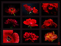
Nine Redby pixelpigComment by drydoc: Ok Pixe, you asked what I think. . . Way too complicated. Way too dark. Way too thick a frame and mullions. KISS. The flowers look like they are in that TV game Hollywood squares. I do like the flower images though. I do not like the drawn in logo. Remember you asked. |
 Photographer found comment helpful. Photographer found comment helpful. |
| 08/27/2008 10:27:10 PM |
Nine Redby pixelpigComment by MaryO: I don't have a problem with the bigger flowers; they make a tic-tac-toe diagonal ;-) The border looks just fine on my monitor, too. All in all a rather stunning presentation. |
| Photographer found comment helpful. |
| 08/27/2008 08:14:37 PM |
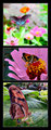
Crazedby pixelpigComment by Purple_Girl: Good title, it invokes an image in my mind of a nutter with a baseball bat doing a number on that window, which incidentally is shot very clearly. 8 from me. |
| Photographer found comment helpful. |
| 08/27/2008 07:34:14 PM |
Nine Redby pixelpigComment by Molly: Very nice composition. I think the larger flowers coming from either corner balance this nicely. Well done! I love red against black! Very powerful! |
| Photographer found comment helpful. |
| 08/27/2008 07:09:20 PM |
Nine Redby pixelpigComment by KarenNfld: I like it, but maybe the poppy should be the same as the others, I don't know, I am no graphic designer. To me the border is a bit of a lighter shade than the background (with a darker border on the outer edge, right?).
I do know it is a gorgeous display. |
| Photographer found comment helpful. |
| 08/27/2008 05:55:43 PM |
Crazedby pixelpigComment by Pikkel: thats cool hard to tell if it is broken ice, glass or something else |
| Photographer found comment helpful. |
| 08/27/2008 05:51:03 PM |
Nine Redby pixelpigComment by tnun: Would really have to think about this. I have a really hard time putting stuff together, whatever the elements. |
| Photographer found comment helpful. |
| 08/27/2008 05:28:09 PM |
Nine Redby pixelpigComment by sfalice: Hard to tell without 'moving the pieces.'
(but)
Try moving the upper right piece to the lower right. (Flip so the flower goes into the frame)
and yes, move the red with yellow trim to the top right.
Try changing the places of the purpleish flower and the center flower.
It's just that it would be nice to have a strong center and good strong anchors at the bottoms.
Um, I'm okay with the little logo. Looks good to me.
I can see the frames - barely - on my screen. I'd boost the color a touch on that frame. NOT much.
There. That's my 2¢
:-))
|
| Photographer found comment helpful. |
| 08/27/2008 05:02:34 PM |
Nine Redby pixelpigComment by inamo: Wow! Stunning and effective photos, I don't like the drawn on logo in the bottom right corner though |
| Photographer found comment helpful. |
| 08/27/2008 04:45:44 PM |
|
| Photographer found comment helpful. |
Home -
Challenges -
Community -
League -
Photos -
Cameras -
Lenses -
Learn -
Help -
Terms of Use -
Privacy -
Top ^
DPChallenge, and website content and design, Copyright © 2001-2026 Challenging Technologies, LLC.
All digital photo copyrights belong to the photographers and may not be used without permission.
Current Server Time: 06/23/2026 12:05:05 AM EDT.