| Author | Thread |
|
|
06/17/2009 01:33:27 AM |
|
are you going to make this available as a print. it is stunning. |
|
 Photographer found comment helpful. Photographer found comment helpful. |
|
|
08/28/2008 12:02:06 AM |
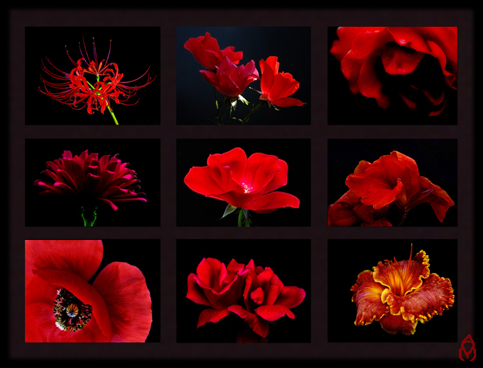
Excellent presentation - near perfect uniformity of the utilitarian black back on the individual images serves this well. Top center image has some illumination in the back, it is very subtle. I would say that the other images also would benefit from the added dimension of that glowing effect.
Message edited by author 2008-08-28 00:07:22. |
|
| Photographer found comment helpful. |
|
|
08/27/2008 11:53:22 PM |
|
Ok Pixe, you asked what I think. . . Way too complicated. Way too dark. Way too thick a frame and mullions. KISS. The flowers look like they are in that TV game Hollywood squares. I do like the flower images though. I do not like the drawn in logo. Remember you asked. |
|
| Photographer found comment helpful. |
|
|
08/27/2008 10:27:10 PM |
|
I don't have a problem with the bigger flowers; they make a tic-tac-toe diagonal ;-) The border looks just fine on my monitor, too. All in all a rather stunning presentation. |
|
| Photographer found comment helpful. |
|
|
08/27/2008 07:34:14 PM |
|
Very nice composition. I think the larger flowers coming from either corner balance this nicely. Well done! I love red against black! Very powerful! |
|
| Photographer found comment helpful. |
|
|
08/27/2008 07:09:20 PM |
I like it, but maybe the poppy should be the same as the others, I don't know, I am no graphic designer. To me the border is a bit of a lighter shade than the background (with a darker border on the outer edge, right?).
I do know it is a gorgeous display. |
|
| Photographer found comment helpful. |
|
|
08/27/2008 05:51:03 PM |
|
Would really have to think about this. I have a really hard time putting stuff together, whatever the elements. |
|
| Photographer found comment helpful. |
|
|
08/27/2008 05:28:09 PM |
Hard to tell without 'moving the pieces.'
(but)
Try moving the upper right piece to the lower right. (Flip so the flower goes into the frame)
and yes, move the red with yellow trim to the top right.
Try changing the places of the purpleish flower and the center flower.
It's just that it would be nice to have a strong center and good strong anchors at the bottoms.
Um, I'm okay with the little logo. Looks good to me.
I can see the frames - barely - on my screen. I'd boost the color a touch on that frame. NOT much.
There. That's my 2¢
:-))
|
|
| Photographer found comment helpful. |
|
|
08/27/2008 05:02:34 PM |
|
Wow! Stunning and effective photos, I don't like the drawn on logo in the bottom right corner though |
|
| Photographer found comment helpful. |
Home -
Challenges -
Community -
League -
Photos -
Cameras -
Lenses -
Learn -
Help -
Terms of Use -
Privacy -
Top ^
DPChallenge, and website content and design, Copyright © 2001-2026 Challenging Technologies, LLC.
All digital photo copyrights belong to the photographers and may not be used without permission.
Current Server Time: 06/30/2026 02:51:26 PM EDT.