| Image |
Comment |
| 09/04/2007 10:01:32 PM |
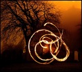
The dance of the flamesby purpleflutterby13Comment by PhotoDave: Originally posted by levyj413:
Wow, what a beautiful shot. Composition, color, everything. Well done! :) |
yea that pretty much sums it up, incredible photo esp the way you managed to capture the fire where it almost looks alive :)
-dave |
 Photographer found comment helpful. Photographer found comment helpful. |
| 09/04/2007 06:42:53 PM |
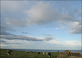
Cow countryby purpleflutterby13Comment by krnodil: I really would have preferred it if the cows had raised their heads instead of lowered their heads. :P Just kidding. I think this is a very true-to-life depiction of a gorgeous landscape - sky is absolutely an important part of what makes this environment sing. |
| Photographer found comment helpful. |
| 09/03/2007 11:12:00 PM |
|
| Photographer found comment helpful. |
| 09/03/2007 11:01:10 PM |
|
| Photographer found comment helpful. |
| 09/03/2007 10:42:30 PM |
|
| Photographer found comment helpful. |
| 09/03/2007 09:45:21 PM |
|
| Photographer found comment helpful. |
| 09/03/2007 09:43:43 PM |
|
| Photographer found comment helpful. |
| 09/03/2007 01:31:51 PM |
Vesnaby purpleflutterby13Comment by JuliBoc: I like the lighting a lot. For the purposes of a portrait I would like to see this cropped a lot, bringing it in to include just her head and shoulders. For a beer ad, this is excellent. It might be fun to play with a cropped version in PS. I'd try selective desat of the cushion and background with a warm tone (sepia?) added, and I'd also try blurring the background more. That might make it more of a portrait and less of a candid. You might also try the cropped version in B&W, which is always effective for portraits if the lighting is good. |
| Photographer found comment helpful. |
| 09/03/2007 12:42:11 PM |
Individualityby purpleflutterby13Comment by h2: well composed shot, petals could be a little sharper. nice lighting, though top right corner is a bit bright. white border is ok here. typeface of headline is somewhere in between, a classic typeface would have worked better, as would a modern sans-serif one; font color is a tad too bright. Handwriting font of subline works well again. |
| Photographer found comment helpful. |
| 09/03/2007 12:10:23 PM |
|
| Photographer found comment helpful. |
Home -
Challenges -
Community -
League -
Photos -
Cameras -
Lenses -
Learn -
Help -
Terms of Use -
Privacy -
Top ^
DPChallenge, and website content and design, Copyright © 2001-2026 Challenging Technologies, LLC.
All digital photo copyrights belong to the photographers and may not be used without permission.
Current Server Time: 07/19/2026 05:44:48 AM EDT.