| Image |
Comment |
| 03/07/2007 02:44:28 AM |
|
| 03/07/2007 02:20:27 AM |
|
| 03/07/2007 12:47:08 AM |
|
| 03/07/2007 12:16:30 AM |
|
| 09/26/2006 08:22:21 PM |
|
| 09/25/2006 11:02:44 AM |
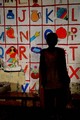
reading leading lines...by aditiComment by posthumous: I like how the actor is almost completely silhouetted. The only thing we see is the back wall. This emphasizes the artificiality of theater, but also, because it is a backdrop of letters, it suggests the entire creative process of theater, which starts as a piece of writing, which is then brought to life by actors and a director. Here we have the actor in darkness, so we feel we are watching the very moment of creation, a sunrise of creativity. 9 |
| 09/20/2006 05:20:52 PM |
the color statementby aditiComment by pineapple: You have a nice sense of photo-journalism and a wonderful location to do it in. I like the rich colours and exotic (to me) cloth in your photo. |
| 08/13/2006 02:05:05 AM |
First Modeby aditiComment by aliqui: It would really add to it if someone/anyone were looking at the camera. Overall the photo is pretty overexposed, but the angle is nice. Good idea though. |
| 08/11/2006 05:54:09 AM |
First Modeby aditiComment by LucidLotus: Cute kids and I can see the relationship to the challenge here. I think the harsh light isn't an asset to this image - the blownout whites are very distracting - and I'm not sure if it was a purposeful post processing move or a random result but the image seems overly contrasty. You have some great colors but the contrasty thing is manifesting them in an unattractive way to me. I like the action in this image, it feels very alive with all the people crowded into the shot but I do wish we could see at least one of the two children in the front, their faces that is. I gave a 4 |
| 08/10/2006 12:51:15 PM |
First Modeby aditiComment by FocusPoint: I am not sure... Idea is there, but I think this could be a better photo with a little different angle. 5 |
Home -
Challenges -
Community -
League -
Photos -
Cameras -
Lenses -
Learn -
Help -
Terms of Use -
Privacy -
Top ^
DPChallenge, and website content and design, Copyright © 2001-2026 Challenging Technologies, LLC.
All digital photo copyrights belong to the photographers and may not be used without permission.
Current Server Time: 07/15/2026 03:55:26 PM EDT.