| Image |
Comment |
| 02/03/2003 06:50:38 PM |
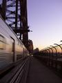
hit the point...by neoathematrixComment by bod: Nice shot. I really like the way the fence seems to glow yellow and there's just the right amount of motion on the train. Great colours & exposure, well done. |
 Photographer found comment helpful. Photographer found comment helpful. |
| 02/03/2003 02:11:01 PM |
|
| Photographer found comment helpful. |
| 02/02/2003 10:45:49 AM |
|
| Photographer found comment helpful. |
| 02/02/2003 08:14:59 AM |
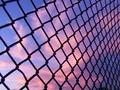
fenceby neoathematrixComment by Jacko: Beautiful colours. I think a dead on shot would made the squares stand out even more. Jacko. |
| Photographer found comment helpful. |
| 01/31/2003 02:10:33 PM |
fenceby neoathematrixComment by Becky: I love the colors in this photo. Seeing the sky through the black fence is nice. |
| Photographer found comment helpful. |
| 01/31/2003 12:44:55 PM |
fenceby neoathematrixComment by PaulMdx: Composition: Slightly lacking interest. Something silouetted in the pic would be nice I think.
Technical: Focus is off a bit of the left side, which due to the size is a little obvious
Meets challenge: Yes
Overall impression: Excellent idea and good photography. An extra subject would make it for me. 6 |
| Photographer found comment helpful. |
| 01/30/2003 11:37:07 PM |
fenceby neoathematrixComment by karmat: A wonderful sky, and I like the repeating pattern of the fence. The fence seems a touch out of focus though, I think sharper would be really cool, and you probably should have cropped the building out of the bottom. |
| Photographer found comment helpful. |
| 01/30/2003 10:06:03 PM |
look rightby neoathematrixComment by goodtempo: Critique Club critique:
Composition/Content: The angle is very creative and adds interest to the image. It's easy to see what you wanted the image to convey, but it is hard to read the sign. I don't know whether or not I would know what it said if it weren't for the title of the image. My eye sees the beginning letters of the sign, and naturally travel along the letters as I read the word, and travel beyond to the bus. The center of attention seems to be right where you might step if you stepped off of the curb on the right. This is a great composition with many elements put together to create the whole.
Lighting: The lighting is dramatic with the wet pavement and reflections. The reflections are what help and hinder the image, making the sign difficult to read. I wonder if you would be able to read the sign if you took the exact image with a slave flash above the sign pointing down to illuminate the painted letters from above, leaving the rest of the image exactly the same.
Background: Background is good with the headlights pointed at the camera.
Camera Work/Technical: Good exposure. I wonder if you raised the camera a little higher off of the street surface and still kept the bus in the same position, whether or not the sign would be legible.
My Opinion: Very creative angle and composition. There is more to the image than appears at first.
|
| Photographer found comment helpful. |
| 01/30/2003 12:43:06 AM |
fenceby neoathematrixComment by GregCamp: Great colors. Beatiful sky. Although the fence doesn't add as much as it could. I think I'd prefer to see the rust on the fence, or at least some more detail. Perhaps a flash with slow sync could pull out the detail in the fence. |
| Photographer found comment helpful. |
| 01/29/2003 03:53:18 PM |
|
| Photographer found comment helpful. |
Home -
Challenges -
Community -
League -
Photos -
Cameras -
Lenses -
Learn -
Help -
Terms of Use -
Privacy -
Top ^
DPChallenge, and website content and design, Copyright © 2001-2026 Challenging Technologies, LLC.
All digital photo copyrights belong to the photographers and may not be used without permission.
Current Server Time: 04/01/2026 01:44:45 PM EDT.