|
|
|
Showing 891 - 900 of ~1608 |
| Image |
Comment |
| 09/29/2003 12:56:31 AM | |  Photographer found comment helpful. Photographer found comment helpful. |
| 09/26/2003 06:48:20 PM | The Sideline Coachby OneSweetSinComment by e301: Anna, I just sent you that last PM ... and so whose shot do I get to write about ...?
I think this is a hugely misunderstood shot: certainly the best of yours that I've commented on. Before I say anything else about it, i think it's worth noticing who's said good things about it and who hasn't from the comments list: and then looing at the quality of thier own shots. Intersting comparisons there :-)
Two things: the emptiness of the stands behind the 'mother' character: suggesting, deliberately or not, that everyone else has long gone, and in her anxiety for her sons' perfprmance she is still working at things: bith an encouraging and a slightly frightening suggestion. The kid's own expression - at first glance a big smile, but on closer examination perhaps slightly forced, slightly uncomfortable with te level of concentration, suggesting that he's just having fun, and not happy with the determination and drive in (presumably) his mother's opinions.
The fence just adds to that atmophere of separation. Great work.
Obviously there aretechnical elements that could have been improved: focus particularly, and perhaps the figures could have been brought slightly more strongly into the frame; the boy particularly appears almost to have crpet out of the composition. but set aginst that the impression that if they were so ideally placed, a lot of the candid nature of the image would have beeen sacrificed, and with that a lot of the quality of genuine observation that goes with it. In many ways, it serves to add feeling to the image.
Ber good, and keep shooting :-)
Ed
|
| 09/26/2003 12:21:24 PM | Fingersby OneSweetSinComment by faidoi: Beautiful vivid colors in the peppers. Would like more focus on a particular pepper. The shot is great as a whole, but your eyes continuously wander around the picture looking for interest. More depth of field in the background would help. The foreground is good. The peppers there are blurred. Maybe a gausian blur would help . I believe it's a legal edit in the challenge. | | Photographer found comment helpful. |
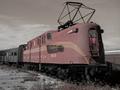
| 09/24/2003 09:36:12 PM | Next Stop 1952 #3by OneSweetSinComment by faidoi: #3 is definitely the best one. The sky is good. No distracting from the tank.
I would still continue to tweak the trains levels a tiny bit. To me it looks a bit flat. I don't know if it because of the tinting you used or not.
The bottom front end looks a bit dark.I know they're usually a lot of great iron work there.
| | Photographer found comment helpful. |
| 09/24/2003 09:36:01 PM | | | Photographer found comment helpful. |
| 09/24/2003 08:57:12 PM | Big Boy's Don't Cryby OneSweetSinComment by frisca: I read your thread about lack of CCs and so I figured I ought to go do one, and LOOK I got yours! What a co-incidence!
Anyway, onto business. Here's your critique club comment!
Color, composition, contrast: Two things I noticed right away about this shot: there is too much tree unnecessarily and it places the boy in the centre of the frame which makes the whole thing seem very static. A crop of a portion of the tree would move the frame over and give it a little more pleasing presentation. Also, the colouring just isn't doing it for me. I think colour shots are wonderful and emotive, but I don't think this shot in colour is doing it justice. A black and white version I think would really play up on the message and the wonderful expression you captured in very basic contrast and I think that would work best.
Another reason this may not have gotten the reaction you were hoping for is that we can't really connect with our subject as his eyes are too far away from the camera. We barely get a sideview, and that hurts the viewer's ability to connect with your subject.
Focus and Lighting:I like how the background is blurred, that helps keep the shot uncluttered. And the focus on your subject is without fault. However, I think there is too much light on his face, and that is throwing off the shot somewhat.
I hope that helps! :) cheers.
Pam | | Photographer found comment helpful. |
| 09/24/2003 08:03:41 PM | Next Stop 1952 #3by OneSweetSinComment by WildflowerJoy: I agree that the last one is SO much better. The sky is so smooth and calm now. The red tank was distracting and took away from the simplicity of the shot. | | Photographer found comment helpful. |
| 09/24/2003 07:21:58 PM | | | Photographer found comment helpful. |
| 09/24/2003 07:01:44 PM | | | Photographer found comment helpful. |
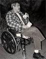
| 09/24/2003 06:44:18 PM | The Real Price of Freedomby OneSweetSinComment by e301: oh alright then :-)
I both love and hate this photo, I think. he makes a wonderful subject - meaningful, both proud and humble simultaneously, affecting, solemn, and questioning: especially in the context of a great number of the other shots in this challenge.
I find the title a bit annoying: but I think that's a cultural difference as much as anything - we're less inclined to such public displays of certainty in Europe.
Technically, however, I think it's a disappointing shot: poorly framed (cutting of the edge of the wheeel and the boot), overly and unevenly flash-lit, purely illustrative in its composition, and ordinary in it's physical view-point. It gives a strong impression of your having been content once you'd seen this subject to simply point the camera at him, everything set to auto, and shap one shot, with no further thought toward what might make imprvements on such a straightforward shot - a different angle of view, a wider or closer framing, or anything. So much so that for me it distracts from the imapct of the image quite considerably.
Ed | | Photographer found comment helpful. |
|
Showing 891 - 900 of ~1608 |
Home -
Challenges -
Community -
League -
Photos -
Cameras -
Lenses -
Learn -
Help -
Terms of Use -
Privacy -
Top ^
DPChallenge, and website content and design, Copyright © 2001-2026 Challenging Technologies, LLC.
All digital photo copyrights belong to the photographers and may not be used without permission.
Current Server Time: 06/03/2026 06:42:17 PM EDT.
|