| Image |
Comment |
| 12/01/2003 05:04:25 AM |
On the Shy Sideby OneSweetSinComment by robsmith: Soft focus?, blurred would be closer. The amount of manipulation is apparent in the skin and background. Poor submission. |
| 11/30/2003 11:34:03 PM |
|
 Photographer found comment helpful. Photographer found comment helpful. |
| 11/30/2003 08:13:54 AM |
|
| Photographer found comment helpful. |
| 11/30/2003 01:03:19 AM |
|
| Photographer found comment helpful. |
| 11/29/2003 12:42:37 AM |
|
| Photographer found comment helpful. |
| 11/29/2003 12:28:16 AM |
|
| Photographer found comment helpful. |
| 11/27/2003 08:21:00 PM |
Creamedby OneSweetSinComment by jmritz: With this photo you deserved a much better score. I gave it an 8 and was surprised it placed where it did. |
| Photographer found comment helpful. |
| 11/24/2003 05:12:55 PM |
Pennilessby OneSweetSinComment by Manikz: Greetings from the Critique Club
composition
I really enjoy the shapes formed by the negative space between the coins, although I think that this could be brought out a lot by having a solid colored background. The crease between the hands that runs off of the top/center of the image is sort of distracting, but easily fixed by trying different angles.
color
If this image were converted to black and white the blue and skin colored reflections would look more like silver, and the green on the dime would not be a problem. This would also help bring out the negative shapes that I mentioned previously.
contrast
I would have liked to see more midtones, see lighting.
focus
Macro is tricky. If you don't hold your camera at the exact right distance often times it is easy to focus on a subject that was meant to be secondary such as the hands in this instance. Try taking the same shot with the camera about an inch further from the subject to capture the coins in sharp focus, and take some of the emphasis off of the hands.
depth of field
Again try to increase the amount of coins in sharp focus. I reccomend setting them on a solid background, and using a longer exposure time.
lighting
I would try taking a light gray card and trying to capture the reflection of it to change the color of the coins faces to be lighter and add more midtones. Also try bouncing your flash off of a ceiling so that the glare doesn't bounce back into the lens creating those distracting white spots on the coins.
any other element of the photo that stands out or is lacking in some way
I think that this was a wonderful idea for the challenge, and with a little bit of development could have easily been one of the best. Hope this helps. ~Rob |
| Photographer found comment helpful. |
| 11/19/2003 09:13:35 AM |
|
| Photographer found comment helpful. |
| 11/19/2003 01:00:08 AM |
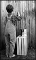
The Adventures Of Tom Sawyerby OneSweetSinComment by Neil: Greetings from the Critique Club:
I really liked this image from book titles, and scored it higher than most if not all other images I scored, so there's not a lot I can say to explain why it didn't place higher. I think the composition is excellent, the choice of B&W as well. Though now, thinking about it, it might have worked even better in sepia for an old fashioned look. Other minor details for perfection: the coveralls could have been a bit rattier, or maybe at least "shorter fitting" and the paint brush could have been visible. Of course, at the risk of ruining a good fence, technically, he should have been whitewashing the fence, so a white pain on the brush might have been a good start, and then just show the bristles.
Lastly, the technical capture is excellent, but maybe some directional lighting and shadows might have given it more pop.
But these are just thoughts to improve an already EXCELLENT photo. |
| Photographer found comment helpful. |
Home -
Challenges -
Community -
League -
Photos -
Cameras -
Lenses -
Learn -
Help -
Terms of Use -
Privacy -
Top ^
DPChallenge, and website content and design, Copyright © 2001-2026 Challenging Technologies, LLC.
All digital photo copyrights belong to the photographers and may not be used without permission.
Current Server Time: 06/03/2026 06:15:30 AM EDT.