DPChallenge: A Digital Photography Contest You are not logged in. (log in or register
 
Browse Settings
Currently viewing:
Registered UserOneSweetSin

Show comments:

Per page:

Order:

Comments:


Comments Received by OneSweetSin
Pages:   ... ... [161]
Showing 241 - 250 of ~1608
Image Comment
A Weight Watcher's Delight
07/23/2004 12:13:12 PM
A Weight Watcher's Delight
by OneSweetSin

Comment by jpochard:
Nice clear photo and good colors. The composition doesn't really interest me, and I think the bottle looks a bit tilted to the left.
A Weight Watcher's Delight
07/23/2004 01:31:35 AM
A Weight Watcher's Delight
by OneSweetSin

Comment by webgirl:
I like the contrast of the strawberries and chocolate syrup against the white background. Maybe some separation light for the white cap.
Photographer found comment helpful.
A Weight Watcher's Delight
07/21/2004 11:26:17 PM
A Weight Watcher's Delight
by OneSweetSin

Comment by cinamnshortcake:
A little noise on the bottle but really cute idea! I think this will probably be one of many strawberry and chocolate shots I'm about to see..but I like this one.
Photographer found comment helpful.
A Weight Watcher's Delight
07/21/2004 11:42:35 AM
A Weight Watcher's Delight
by OneSweetSin

Comment by menardmam:
Look good , but way too much noise a3
A Weight Watcher's Delight
07/21/2004 10:00:05 AM
A Weight Watcher's Delight
by OneSweetSin

Comment by justine:
Little noise/grain. I do love all the colors.
Photographer found comment helpful.
A Weight Watcher's Delight
07/21/2004 08:37:52 AM
A Weight Watcher's Delight
by OneSweetSin

Comment by admart01:
Funny idea. Crisper focus on the berries and less-flat lighting would make this a bit more interesting
Photographer found comment helpful.
A Weight Watcher's Delight
07/21/2004 12:26:50 AM
A Weight Watcher's Delight
by OneSweetSin

Comment by Allyrellia:
The focuse seems a bit soft... and it's weird how the cap appears to be floating, but I like the setup here.
Photographer found comment helpful.
A Weight Watcher's Delight
07/21/2004 12:20:30 AM
A Weight Watcher's Delight
by OneSweetSin

Comment by ddmckinney1954:
a bit soft but still very nice composition
Photographer found comment helpful.
Lemonade...25 Cents
07/14/2004 07:55:17 PM
Lemonade...25 Cents
by OneSweetSin

Comment by graphicfunk:
From the critique club:
There is too much ambiguity in this picture. It seems that you rushed or where very pressed for time because the basic requirements were ignored. Allow me to offer a few pointers.
Advertising are the hardest compositions to make. They are tedious to photograph because they require so much preparation. Be careful of introducing other elements. If you use a model, you complicate your life even more. The model must be dressed and now you need to capture the right expression. In this case, this attractive model was not ready for this promotion.
The sign in the back makes the viewer go to his face and then down the picture, but while the orange T shirt, adds color, the viewer has to pause and decipher it. Now the eye is at the pitcher and one wonders of this an ad for Smuckers and one relooks at the sign again.
In short, I note you have the capability to compose a shot, and yes, I know, sometimes ideas strike at the last minute. When they do, consider the time factor. If you are too pressed against the wall, it is best to forget it. Too late.
Do not feel too bad, all photographers experience similar situations. They proceed well knowing that important considerations will suffer. Just go and make your next challenge a winner.
Photographer found comment helpful.
The Beginning of the End
07/14/2004 05:52:19 PM
The Beginning of the End
by OneSweetSin

Comment by L1:
Howdy from the Critique Club...

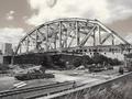
This image has two assets that I see right off the bat - visual interest and angle. The bridge itself is a good subject, and the angle from which it is shot is appealing.

Visually, the bridge is interesting enough alone. There are many other items in the picture that tend to compete with it for attention. The machinery in the lower third of the photo is a bit small and difficult to see with any discernable detail. I believe a tighter crop would be quite nice, leaving the bridge and sky, and removing the distracting elements at the bottom and on the left side. Perhaps a shot from down in the railroad track area, looking upwards toward the bridge and sky would also work well. That, of course, might not have been possible, and I understand.

I do wonder what the shot might look like in natural color. The desaturization you have used is effective, but the shades and tones are all so similar that many of the details have been lost. The sky, however, does look quite stunning and works well with the colors you have chosen.

The title you have chosen is nice, but for someone who is unfamiliar with bridge demolition, it was difficult for me to see that the bridge was actually being torn down.

Overall, this is a good photograph with some positive elements and some points upon which to improve. I have enjoyed studying it and wish you the best in future challenges.

CC
Photographer found comment helpful.
Pages:   ... ... [161]
Showing 241 - 250 of ~1608


Home - Challenges - Community - League - Photos - Cameras - Lenses - Learn - Help - Terms of Use - Privacy - Top ^
DPChallenge, and website content and design, Copyright © 2001-2025 Challenging Technologies, LLC.
All digital photo copyrights belong to the photographers and may not be used without permission.
Current Server Time: 08/04/2025 10:50:59 PM EDT.